Holbrook Travel’s website refresh
Over the time I was at Holbrook Travel, I helped to design and launch two website refreshes:
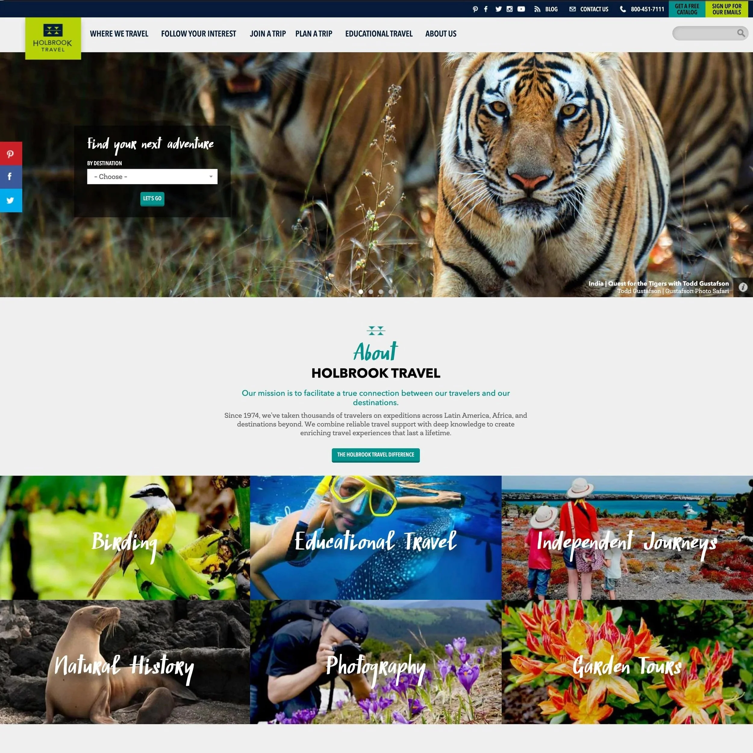
When I first started at the company, their website looked like this and they were in the process of updating it:
Clients were frustrated, employees were frustrated, and making updates was a very slow and manual process. I worked with several web developers as well as our internal team on updating the entire site to a Wordpress CMS, so management and updates were far easier and more accessible to folks working in the company.
When I left the company, we were working on further modernizing the website, and the new version was launched not long after I took a new position elsewhere.
A lot of the work in this phase was focused on building out systems what were scalable; in terms of typography, color, and imagery.
We had a large and rich collection of photographs from past trips, but found ourselves using the same ones over and over, so we created a library that included frequency of use data and helped to prioritize the use of under-chosen shots that were still stunning
We developed custom web and print fonts that aligned with our branding and tone, and evolved some of the styles of type family we were already using
Color added context: Types of trips were now highlighted with their own specific color so users had clearer clues as to what types of trips they were looking at