
Zumba® Fitness App
+ UX/UI design
+ User and pattern research
+ User flows
+ Clickable prototyping
+ IA
+ Copywriting
+ Design pitch to client
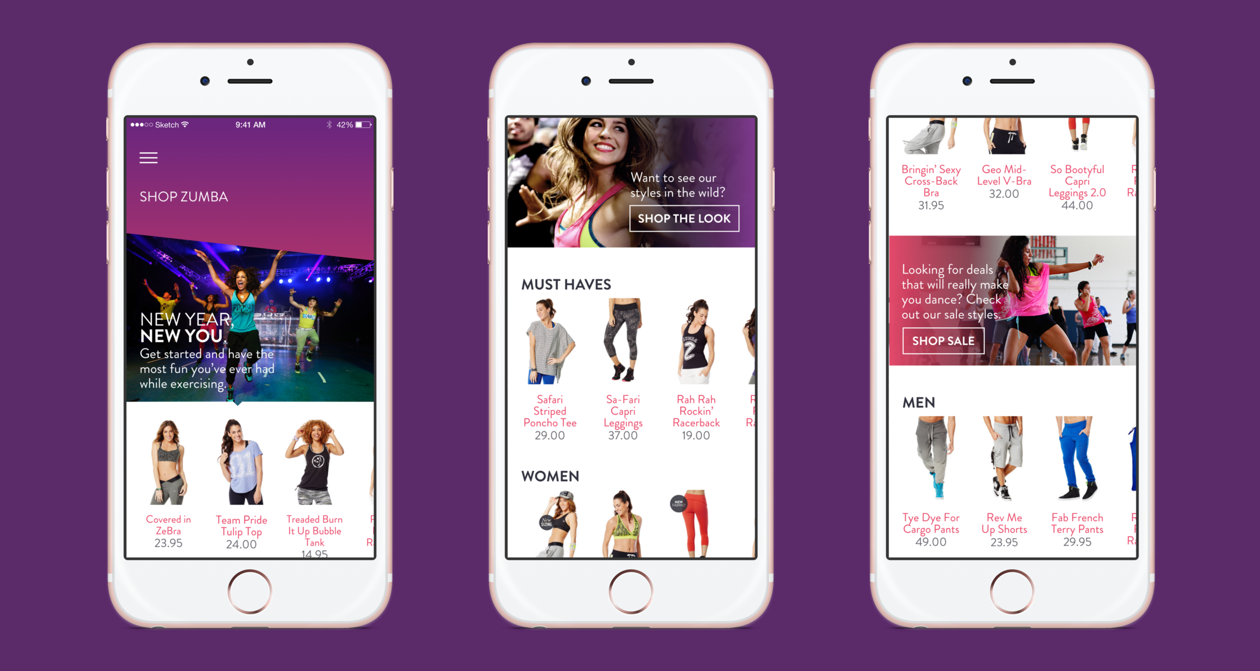
I designed screens for a fitness app for a pitch to Zumba®. The app created a social community for both students and instructors, as well as a hub for the company's merchandise store and digital content.
Typeface: Brandon Grotesque


Problem
The client approached us with a need to refresh the look and feel of their fitness app in addition to adding functionality to create a more robust user experience.
Process
Our team immediately signed up for Zumba® classes and started talking to participants and instructors to get a feel for what they would want to see in a revised version of the app. We asked where pain points existed with the current app and what gaps they felt were present. We heard a few things repeated over and over; users didn't have a lot of use for the app and didn't feel a need to use it on a regular basis. We wanted to create entry points to the app so the experience could be more consistent.
We began exploring several different directions from a functionality standpoint (instructor profiles, playlists, class checkin capability, and a more in-depth shopping experience) until we came up with solutions we felt both addressed the client's needs as well as the users' wants. Previous versions of the app had been difficult to navigate, so a simple structure and navigation pattern was a key element in our redesign.


The visual approach incorporated styles from the client's current website while introducing a more bold, colorful, fun aesthetic. We wanted to guide the user through the app while maintaining the fun, playful atmosphere they experience in their Zumba® classes.
We started exploring navigation structures and went through a few iterations before finally deciding to use a hamburger icon in the top top-left of the screen that leads to a full-screen menu.
There is a tendency for many apps in this sector is to overload the user with options, so we stuck with a simple interface that allows for intuitive movement by swiping through screens and utilizing a single-point menu in the top left of the app. We also created several user flows that were close-ended, leaving the navigation structure with only two tiers. This allowed the user to avoid areas of the app they felt were 'hidden' or 'dead ends,' which were pain points identified in our research.
We also refreshed the store experience, integrating commerce via Instagram-based third-party services (similar to Like2Buy) that connected users directly to the shopping experience within the app.


Results
The client was thrilled, and initial user testing resulted in positive reactions to the new interface. One user referred to the app experience as being "simple and exciting to use," and many mentioned the simplified navigation as their favorite part of the refresh.