The Cortina Agency / Anvil Knitwear
Anvil Knitwear lookbook
Context
Graphic Designer · 2010
Services: Editorial design · Art direction · Publication design · Print production
Client: Anvil Knitwear (via The Cortina Agency)
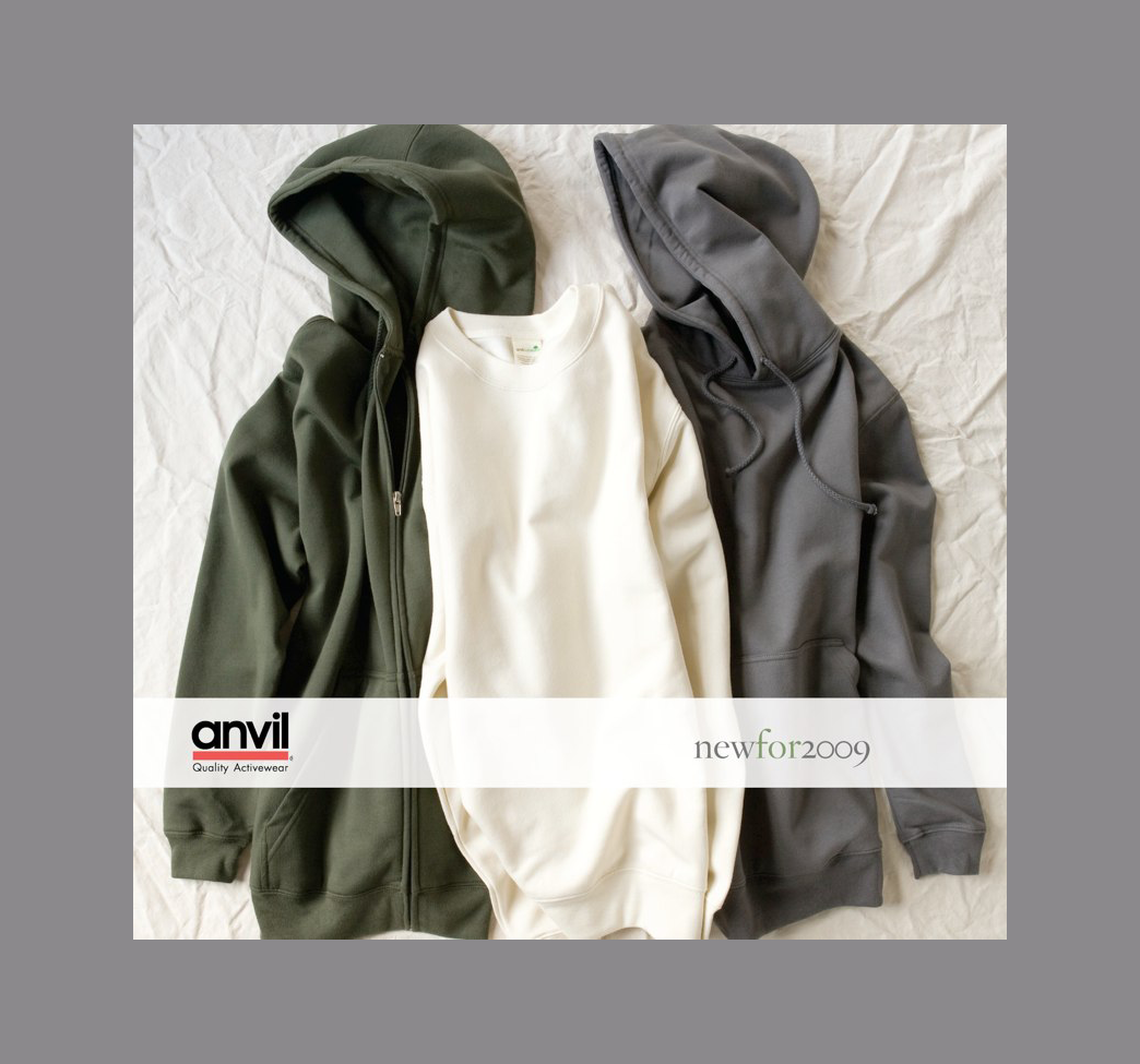
Where the catalog told buyers what Anvil makes, the lookbook showed what's possible. Designed the same year as the 2009 catalog, it's the same brand and the same product line — but an entirely different register. Less specification, more story. Less reference document, more leave-behind that a buyer might actually keep on their desk.
Approach
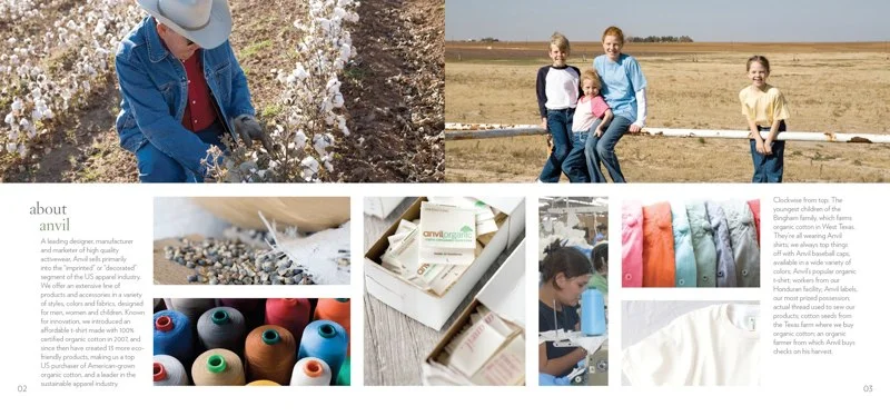
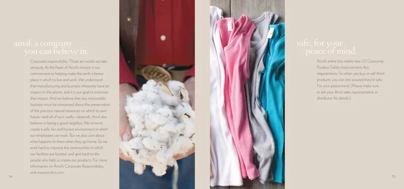
The creative direction established an editorial structure organized around product stories rather than product categories — "the return of neon" for the chromaZONE line, the American cotton farmer story for sustainability, brand values for corporate responsibility. Each section had its own visual treatment while sharing a consistent typographic voice throughout.
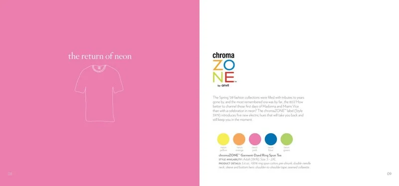
The standout design decision was the neon spread: rather than leading with a product photo, the left page is full-bleed neon pink with a single outlined t-shirt illustration — almost a negative space treatment. It stops you. The right page delivers the product detail and color swatches in clean, airy type. The contrast between the bold left and restrained right is what makes it work.
The neon spread also came with a real production challenge. Neons can't be reproduced in standard CMYK — they require specialty Pantone spot colors — and the first press run came back significantly off. I worked directly with the printer to diagnose the issue, ran the color checks, and oversaw the recalibration through to a correct final print. It's the kind of problem that only gets solved if someone who understands both the design intent and the print process is in the room.
Art direction on the photography was central to the project — briefing the photographer and stylist on the lifestyle context for each section, reviewing selects, and making sure the imagery carried enough warmth and specificity to feel editorial rather than stock. The cotton farmer spread, with its field photography and close-up texture shots, is a good example of that approach working at its best.
Outcomes
- Used at industry trade shows as a premium leave-behind for key accounts
- Sales team cited it as a meaningful differentiation tool from the catalog
- Buyer feedback noted it as helpful for visualizing end-use applications for Anvil blanks
- The editorial direction was considered a step-change from previous Anvil marketing materials