The Cortina Agency / Anvil Knitwear
Anvil Knitwear 2009 catalog
Anvil Knitwear's 2009 Collection catalog, a full product reference for wholesale apparel buyers.
- Problem
- Anvil's main sales reference had to organize hundreds of SKUs, accurate color swatches, and the specifications buyers relied on for purchasing decisions.
- My role
- Graphic designer at The Cortina Agency, covering layout, photography direction, and all print checks and production through final delivery.
- Key decisions
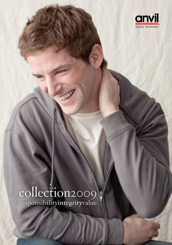
- Took an editorial direction, with a lifestyle cover and values tagline instead of a product grid.
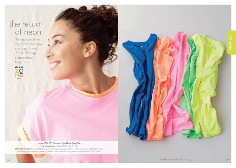
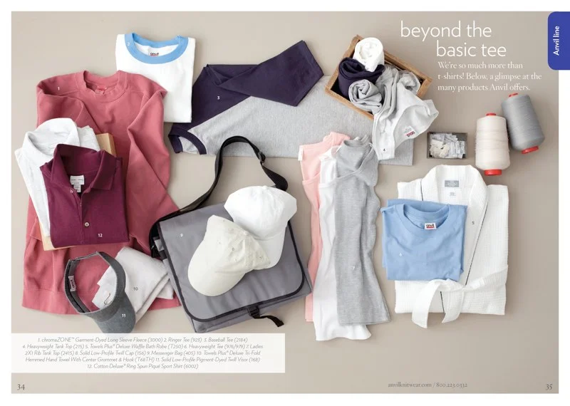
- Opened each section with a themed story spread before the detailed product pages.
- Built color accuracy and consistent flat lay and ghost mannequin standards into the workflow.
- Outcomes
- Delivered on schedule for trade show season, and the layout system carried forward into later catalogs.
Context
Graphic Designer · 2009
Services: Publication design · Layout system · Photography direction · Print production oversight
Client: Anvil Knitwear (via The Cortina Agency)
The Anvil 2009 Collection catalog is the brand's primary sales reference — a comprehensive guide to every garment in the line, organized for professional buyers in the decorated apparel industry. At this scale, it's as much an information design problem as a graphic design one: hundreds of SKUs, dozens of product families, color swatch accuracy requirements, and specifications that buyers would rely on to make real purchasing decisions.
Approach
The design direction was deliberately editorial — closer to a fashion trade publication than a typical wholesale catalog. The cover leads with lifestyle photography and a values-driven tagline ("responsibility integrity value") rather than a product grid, positioning Anvil as a brand with a point of view rather than just a supplier.
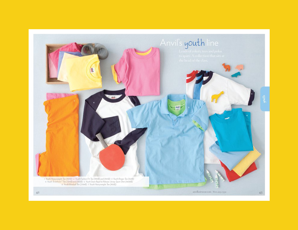
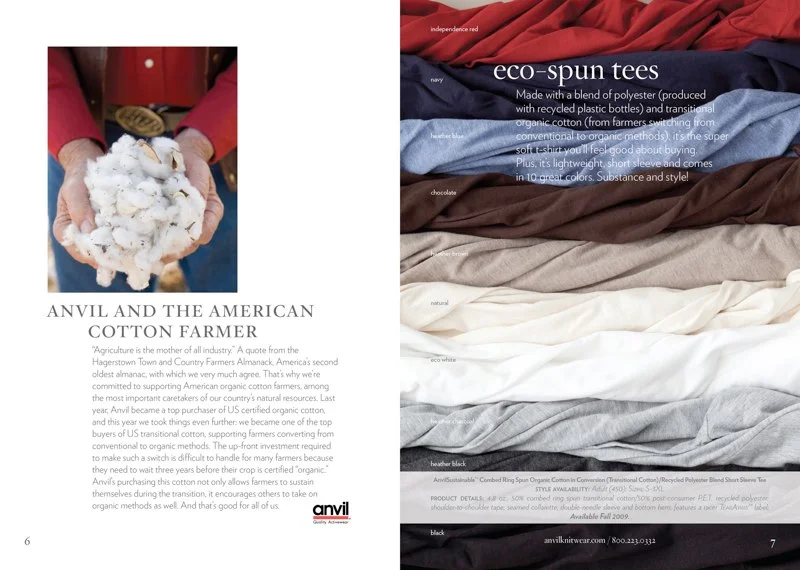
Inside, each section opens with a themed spread that tells a product story — "the return of neon" for the chromaZONE line, "beyond the basic tee" for the accessories and extras — before moving into detailed product reference pages. This structure gave buyers a reason to actually read the catalog rather than skip straight to the SKU listings, while the product pages still delivered everything needed for ordering decisions: numbered flat lays, color swatches, style numbers, and specifications in a clean typographic hierarchy.
Photography direction was part of the work: consistent styling standards, ghost mannequin and flat lay conventions maintained across the product range, and color accuracy requirements built into the production workflow from the start — because a swatch that doesn't match the actual garment is a problem that starts at the design table.
Outcomes
- Oversaw all print checks and printing production for the marketing team, from press proofs through final delivery
- Delivered on schedule for the trade show season
- The layout system established in this edition was carried forward into subsequent catalogs
- Anvil's sales team cited improved navigability over previous editions
- The editorial approach contributed to Anvil's positioning as a premium brand in the wholesale apparel market