SurveyMonkey
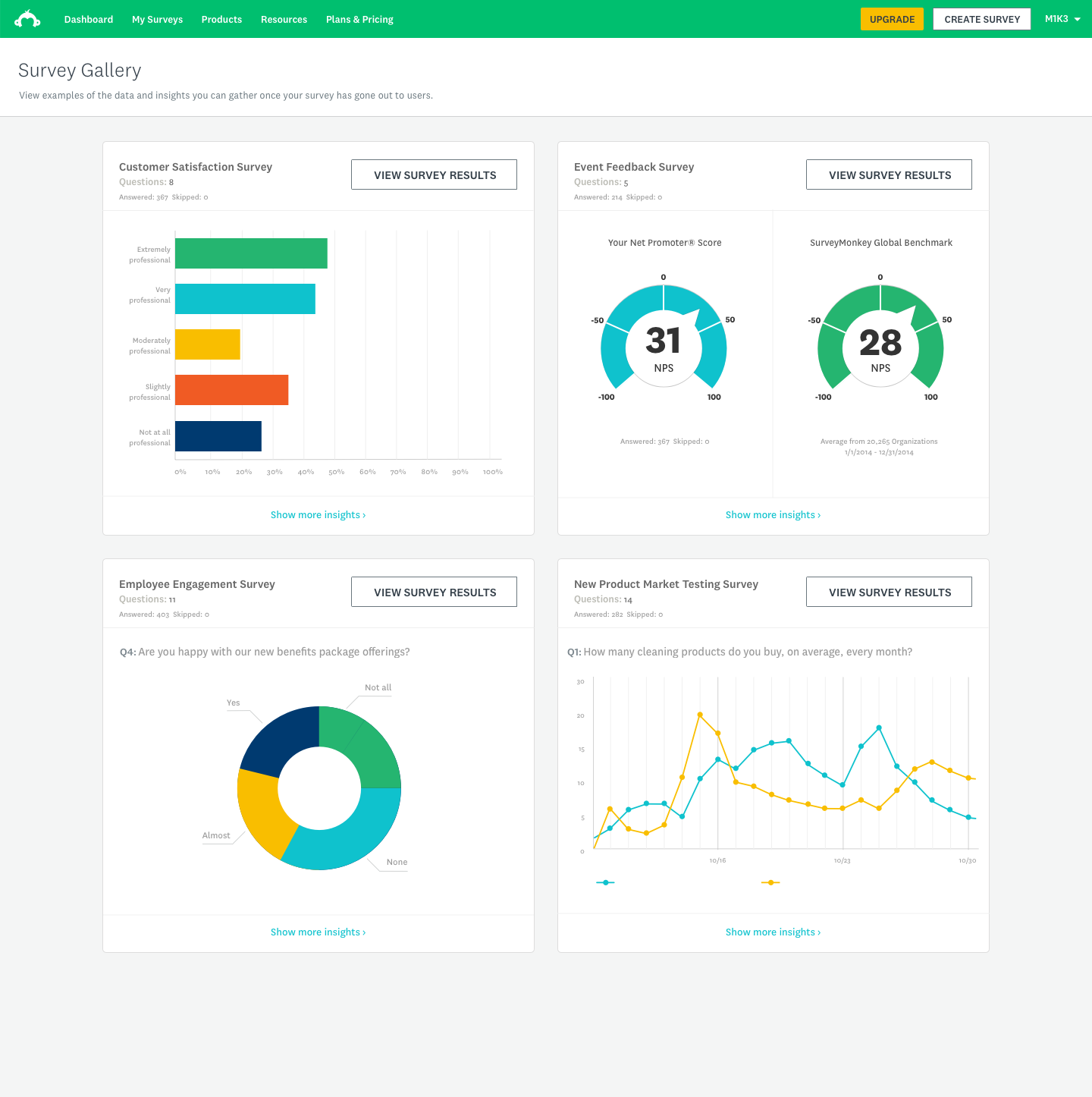
Survey gallery
Context
Lead Product Designer · 2018–2019
Services: Design strategy · Interaction design · UI · Prototyping · Analytics building
Objective
Allow explorers to see value in data analysis at the beginning of their user journey.
Overview
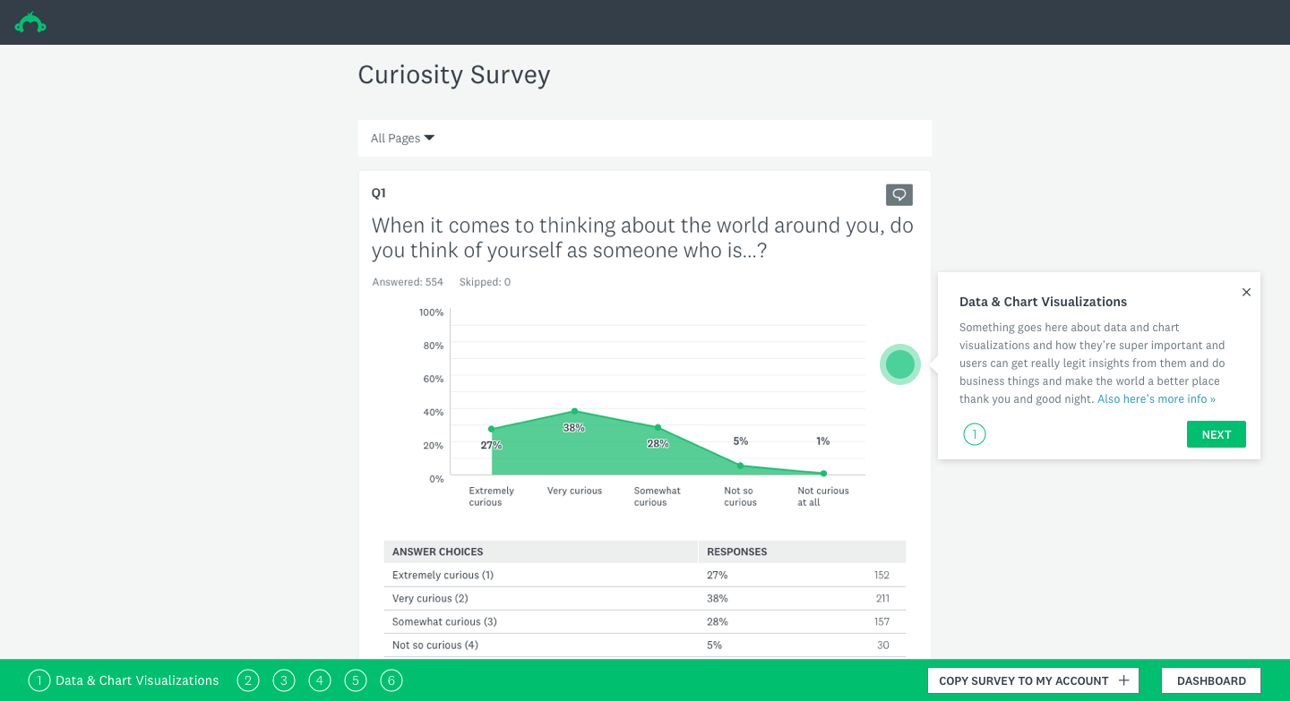
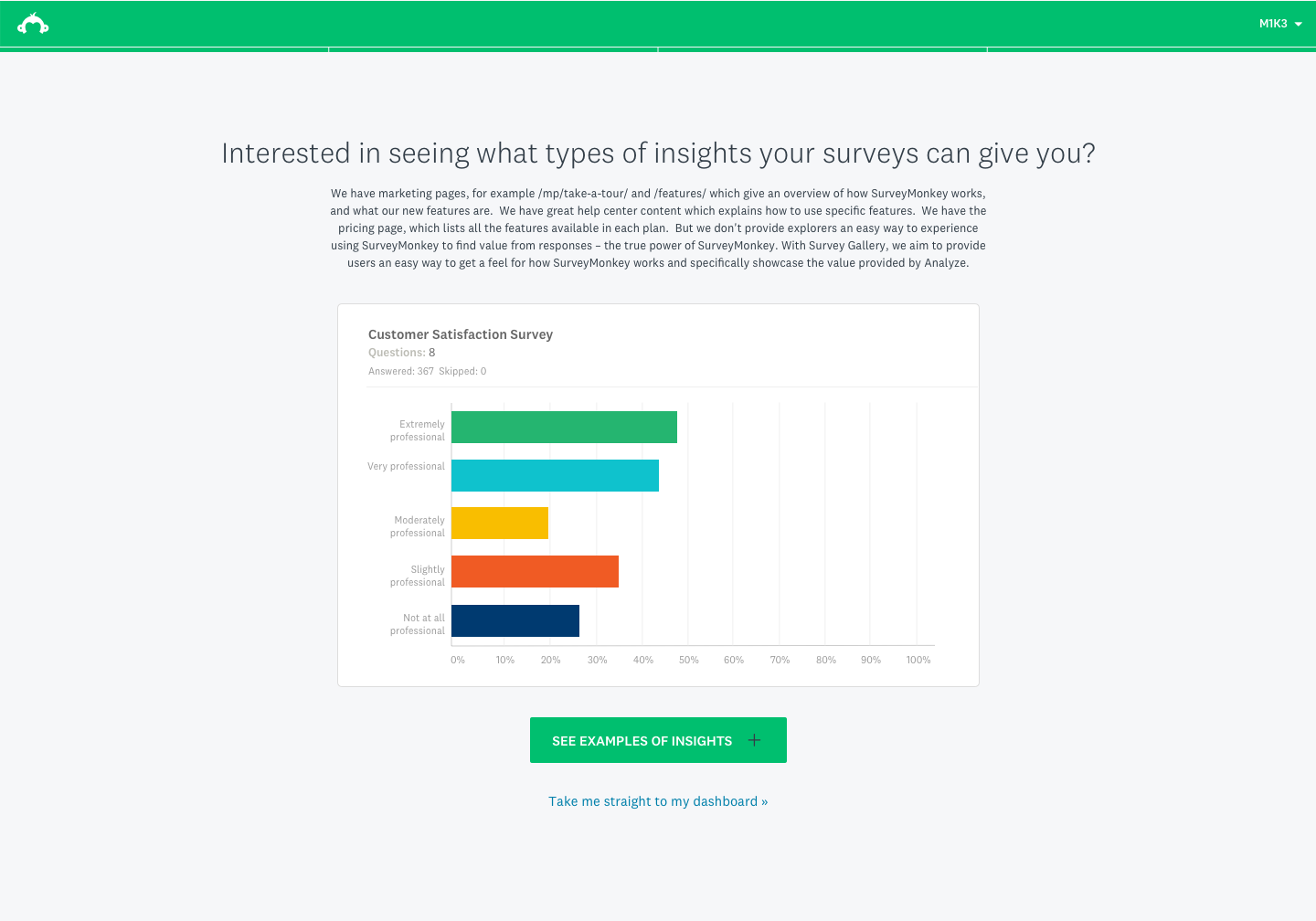
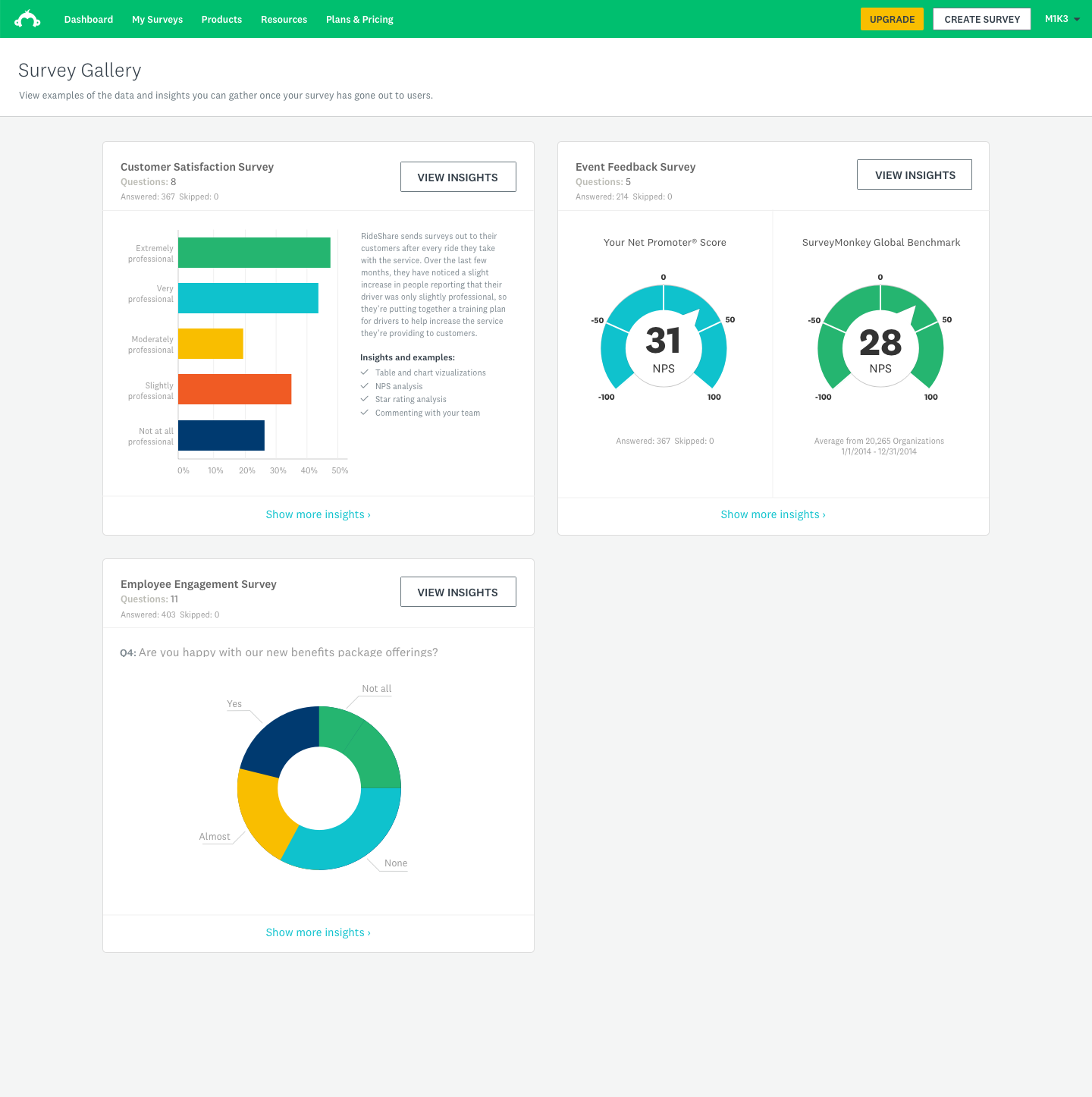
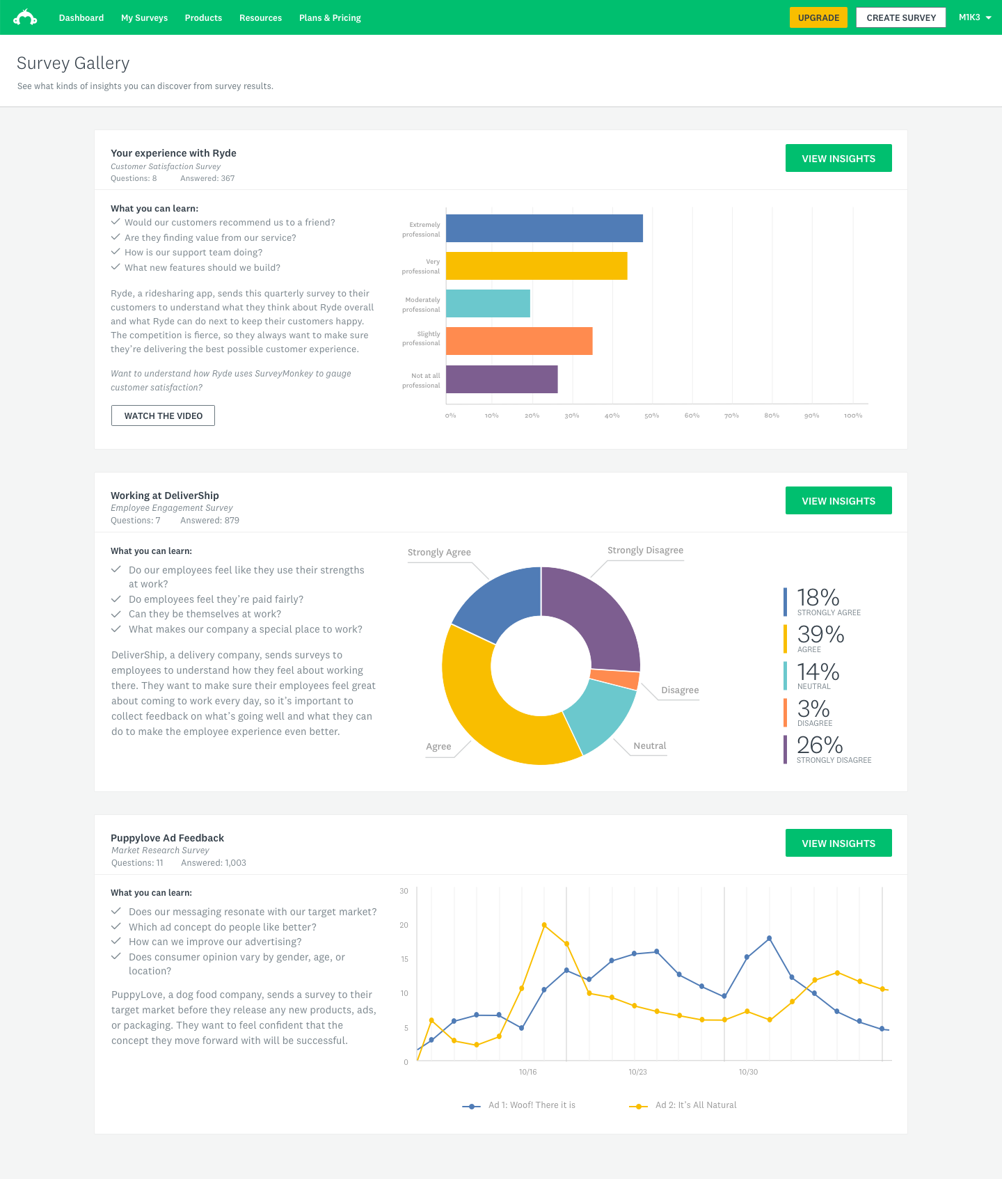
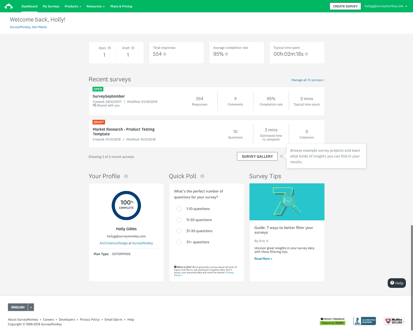
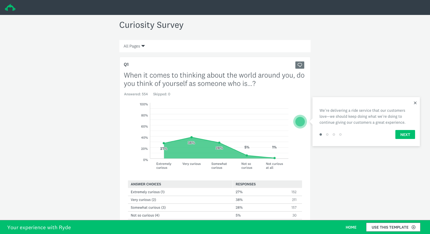
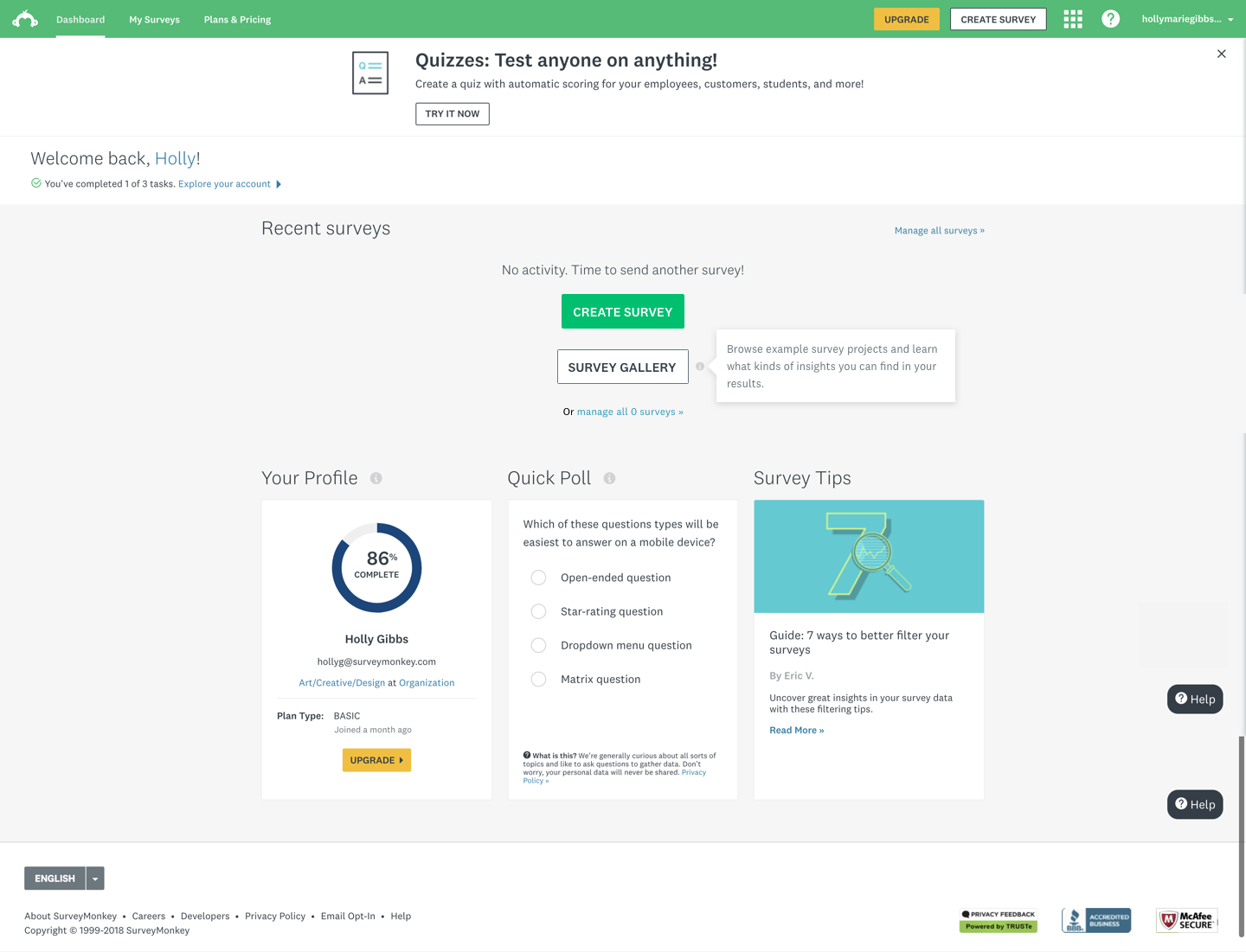
As our product, we wanted to use the Survey Gallery to display curated survey examples to users who were logged in or browsing the dashboard. This would allow users to get a glimpse of the great things they can do with the SurveyMonkey product suite. The ultimate objective of this project was to show users the great summary tables and powerful but simple charts and overall capabilities — essentially, to show as an example of a self-customized survey to give users an idea of how the data looks once they have their survey results ready to enable them to make an impact.
We also identified an underutilized group of users who currently come to SurveyMonkey from a template library but tend not to start surveys from scratch. Our goal was to understand how these users were spending their time, and we wanted to surface the value prop in a new way.
My contributions
Workshop facilitation
Facilitated cross-functional design thinking workshops with PM, strategy, visual design, interaction design, and engineering to define team goals and align on direction.
Strategy & direction
Drove the creative and strategic vision for the feature, helping the team reframe from a creation-first to a value-demonstration-first approach for the Explorer segment.
User research
Partnered with the User Research team to design and run moderated usability sessions with Explorer-segment users, uncovering key insights that reframed the design direction.
End-to-end design
Designed the full feature experience — from IA and flows through gallery tiles, sample surveys, zero states, onboarding coachmarks, and the final shipped UI.
Business rationale
SurveyMonkey's core product was built to serve a broad, horizontal user base — but that breadth came at a cost. A significant segment of users, which we called Explorers, arrived at the product with genuine curiosity but no clear entry point. They'd browse templates, click around, and leave without ever experiencing the thing that makes SurveyMonkey powerful: seeing real, actionable data.
The hypothesis was straightforward: if we could show Explorers what populated survey results actually looked like — before they'd committed to creating anything — we could dramatically shorten the distance between curiosity and conversion. The Survey Gallery was our answer to that gap.
The business case centered on improving the basic-to-paid conversion rate for this segment, and on demonstrating that surfacing the analytics experience earlier in the user journey would meaningfully increase engagement and product comprehension.
Design strategy & user research
Design thinking workshop
I facilitated a design thinking workshop that included members of the Product Design, App Security, Content Strategy, Visual Design, Project Management and Engineering teams. The goal was to get cross-functional alignment on what problem we were actually solving, what success looked like, and what ideas were worth pursuing.
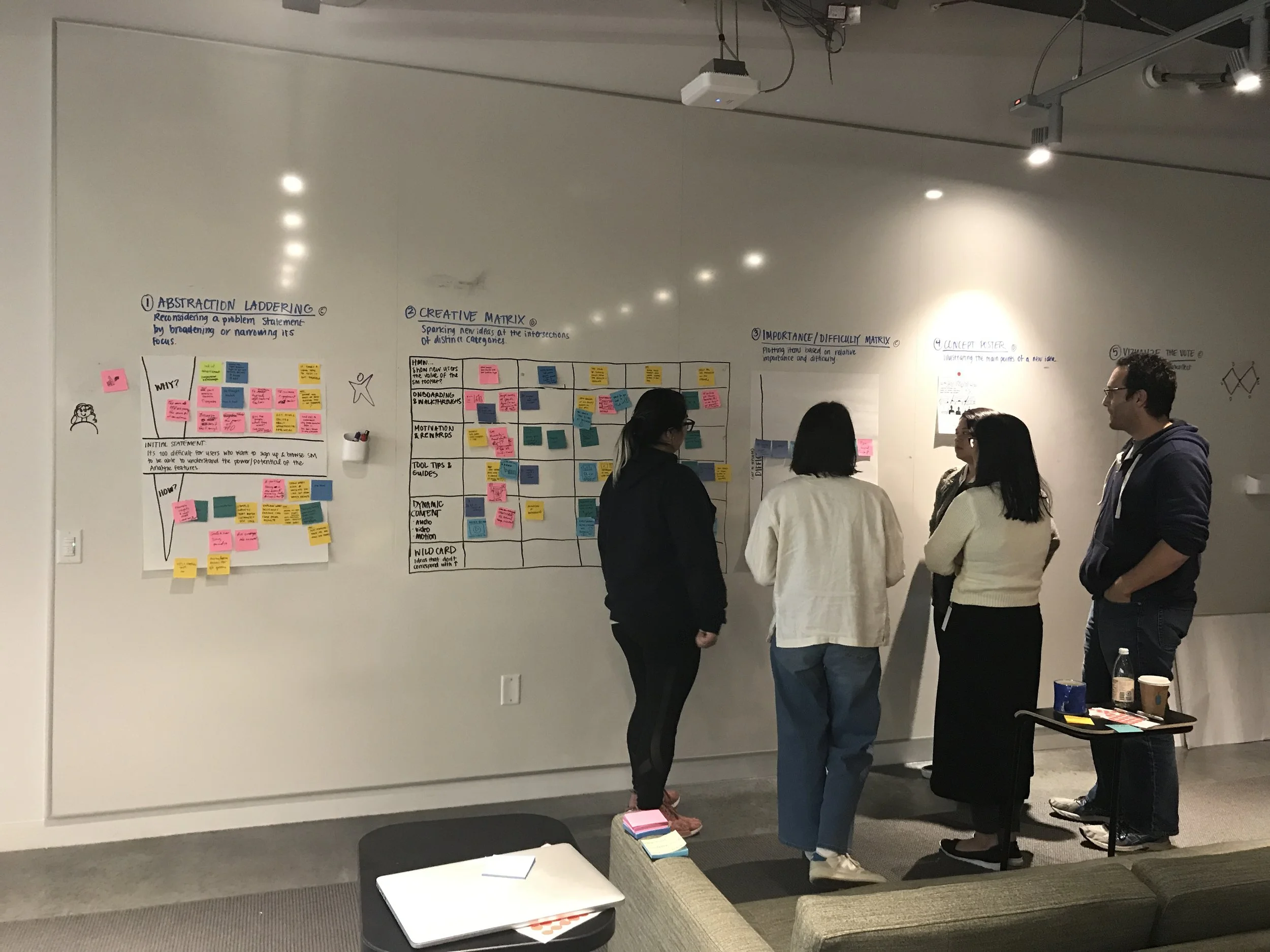
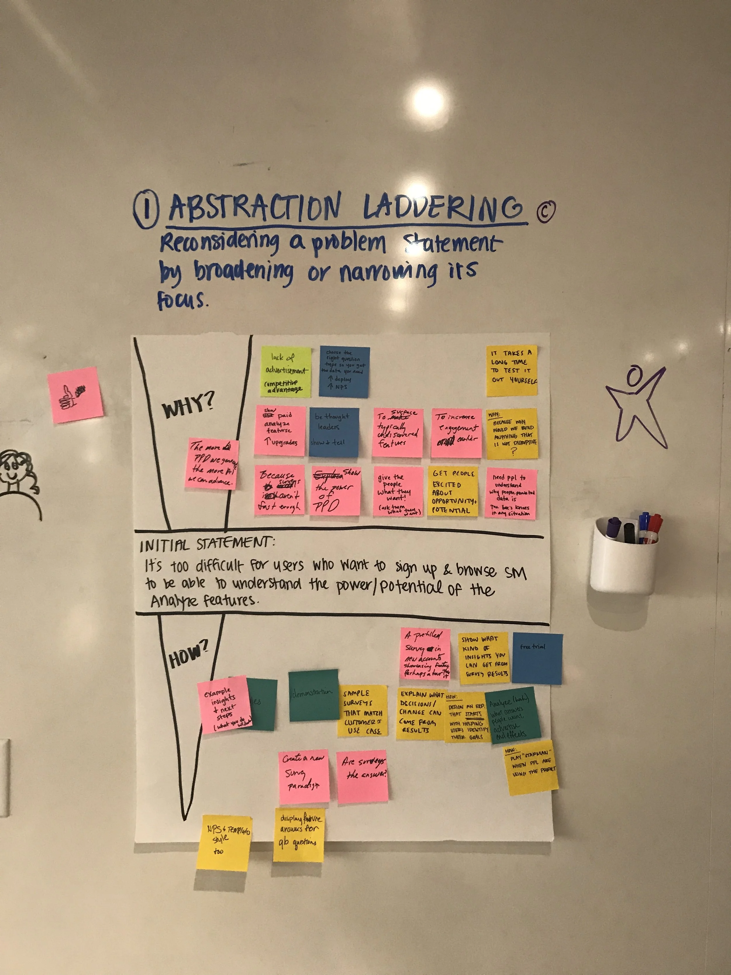
Abstract laddering
We used abstract laddering to push the team past feature-level thinking. Starting from a concrete product idea, we kept asking 'why does that matter?' until we reached the underlying user value. This helped us separate the what from the why and gave the team a shared language for evaluating ideas against genuine user needs rather than surface-level appeal.
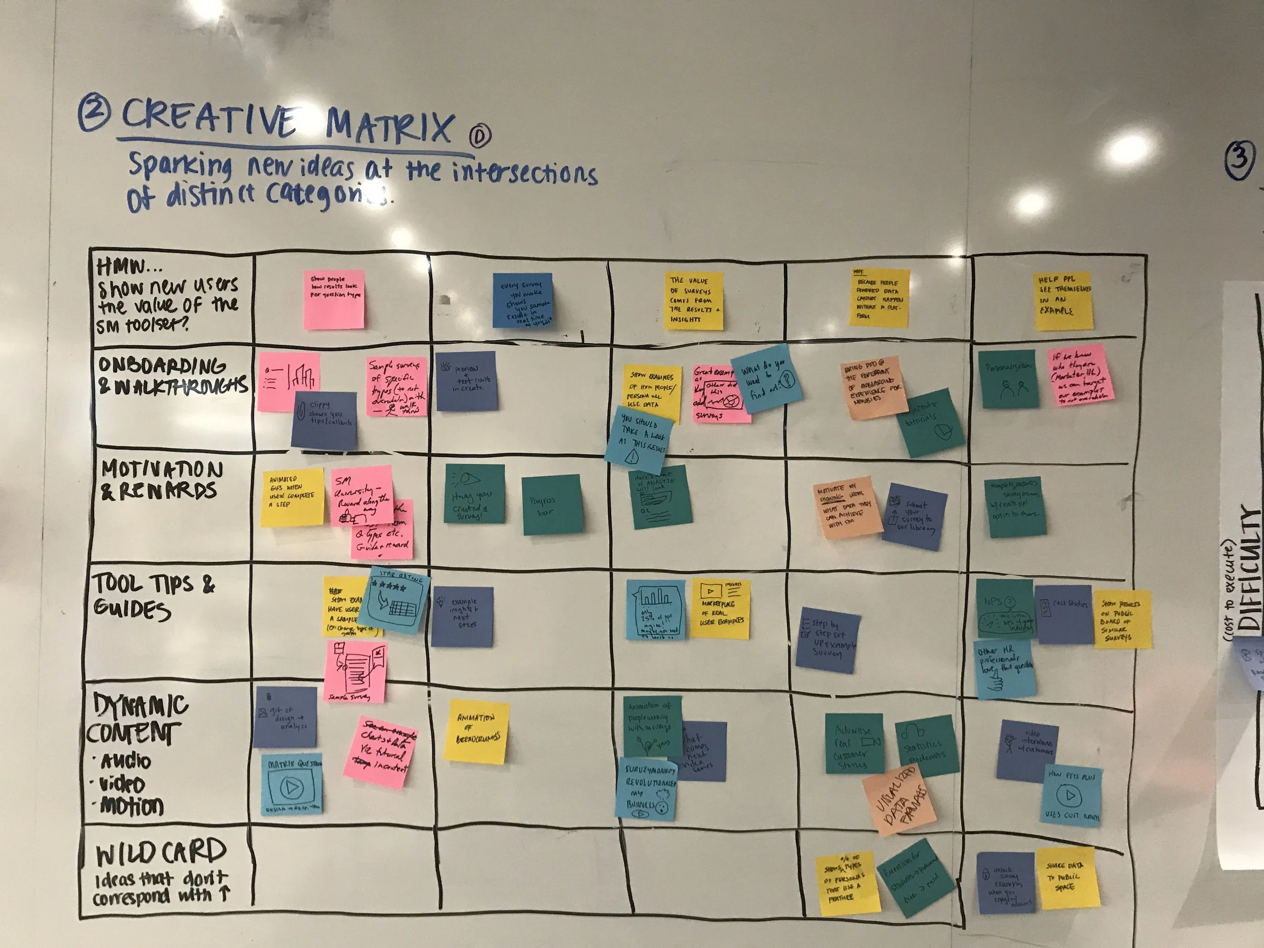
Creative matrix
The creative matrix let us rapidly generate and organize a wide range of ideas by mapping user needs against design solution types. It forced breadth first — before any filtering or judgment — and surfaced combinations the team wouldn't have arrived at through straight brainstorming.
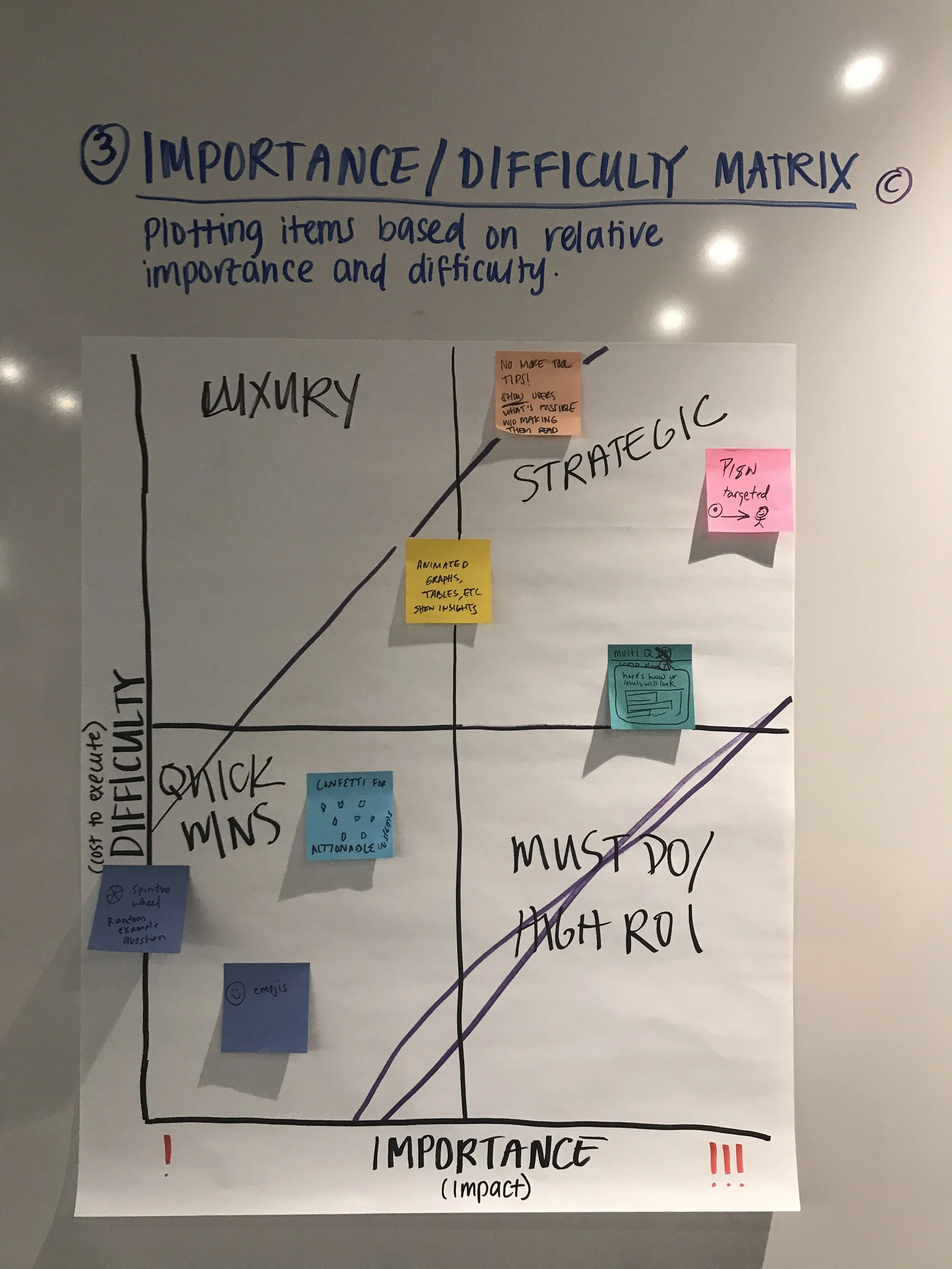
Importance / difficulty matrix
We mapped ideas against two axes — importance to the user and implementation difficulty — to identify where to focus our energy. The clearest signal from this exercise was the high ROI zone: ideas that were low effort to build but high impact for the Explorer persona.
Key themes that emerged from the matrix:
- Low difficulty, high importance: Show graph data in a way that's accessible and easy to understand
- All templates (only multiple choice questions which provide insight without making them a lot of effort)
- Multiple choice question + inputs
- Cards filter by difficulty
- High ROI zone (low difficulty, high importance): Surface pre-completed survey data to help users understand what's possible
Highlighted ideas & themes
- The Visual NPS can be generated the more we can retrieve fill
- Provide templates from an industry point of view
- Choose high resolution paths out of the data you need
- Increase analytics from what habits customers saw in test
Design strategy & user research
User testing
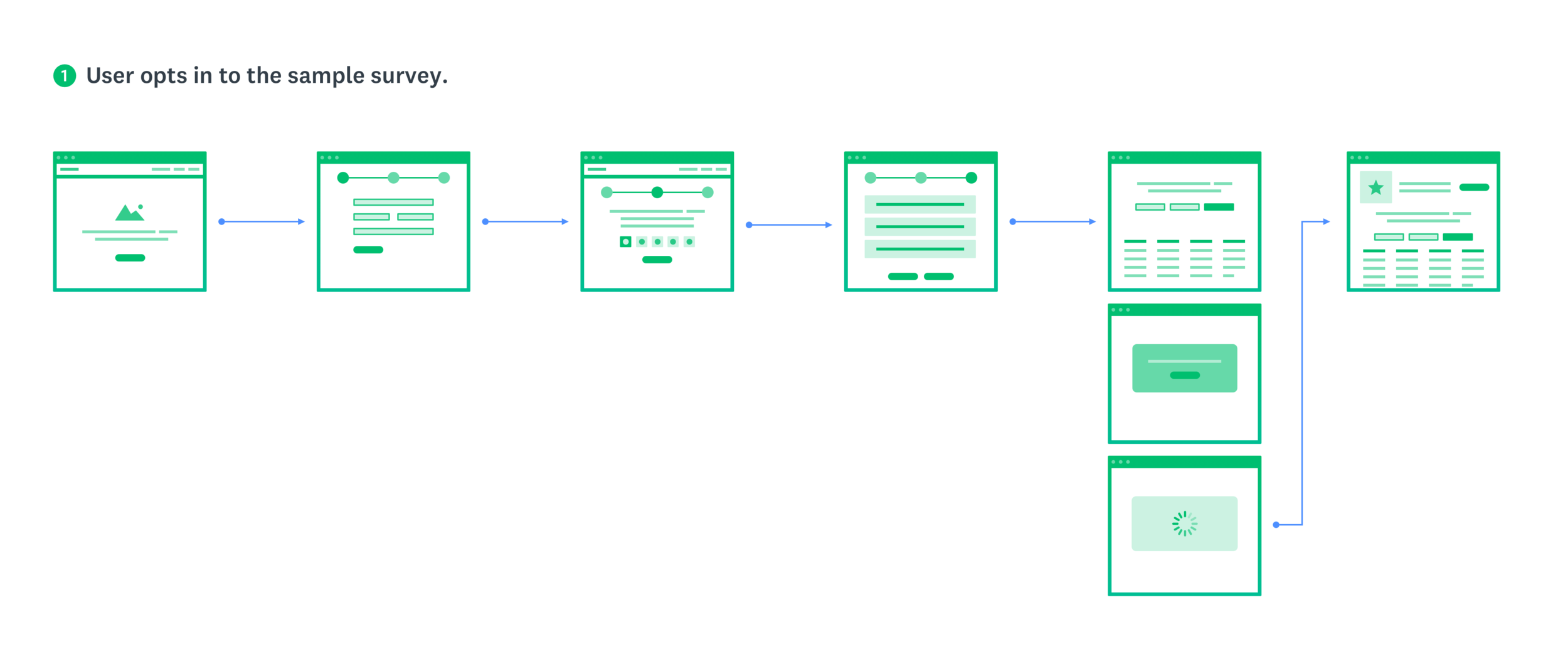
I worked with the User Research team to find where we could discover what exactly our Explorers were looking for in order to make their experience better. We focused our testing on the moment a user first encounters the gallery — what they understood, what confused them, and whether seeing populated data changed their perception of the product's value.
Test details
We ran moderated usability sessions with 10 participants who matched the Explorer profile: users who had signed up for SurveyMonkey but hadn't yet created or completed a survey. Each session walked participants through encountering the gallery in context on the dashboard, exploring a sample survey with populated results, and responding to questions about perceived usefulness and intent to return.
Results
Of users: 10 respondents rated the helpfulness 4 or 5 out of 5.
Key takeaways:
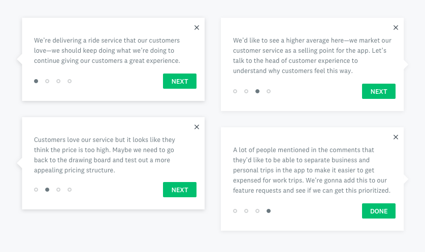
- Users immediately understood the gallery as a demonstration, not as their own data
- Seeing populated charts and summary tables significantly raised confidence in the product's analytical capabilities
- Users who explored the gallery expressed stronger intent to create their own survey compared to those who saw the dashboard without it
- The biggest point of confusion was the transition from gallery to starting their own survey — a clear area for iteration
Design strategy & user research
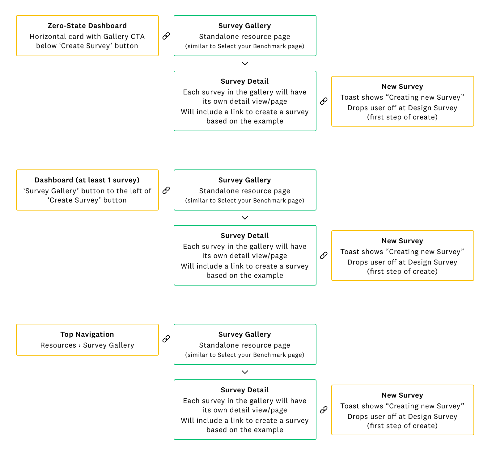
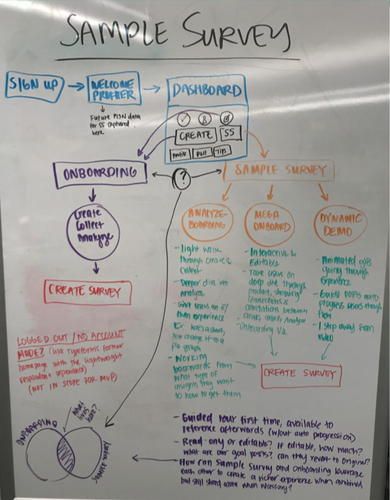
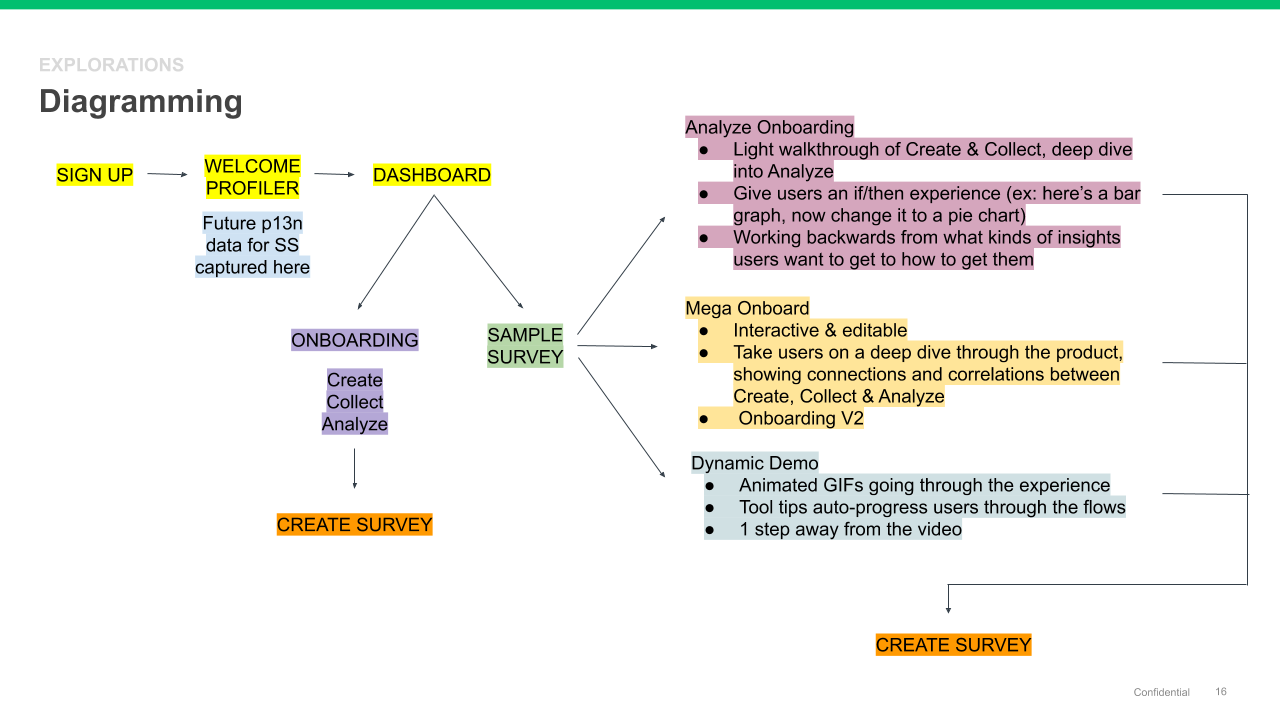
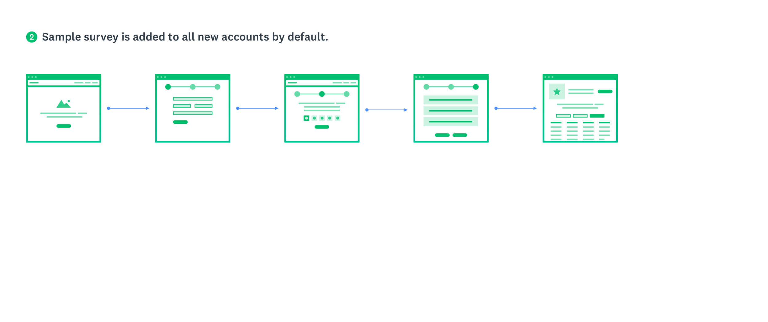
Information architecture & diagramming
In order to better understand how this experience would work and to get a more comprehensive view of how it would exist within our existing core surveys platform, I led the team in diagramming and looking at the IA options in terms of entry and exit points, as well as how the experience might live within a customer's account.
I started with diagramming out several ideas I had been thinking through with our product team, in the workshop, and in the product design critiques I had held with the larger design team.
Some considerations and lingering questions we wanted to answer included:
- Would this be a guided tour the first time, then remain available to reference in the user's account afterwards?
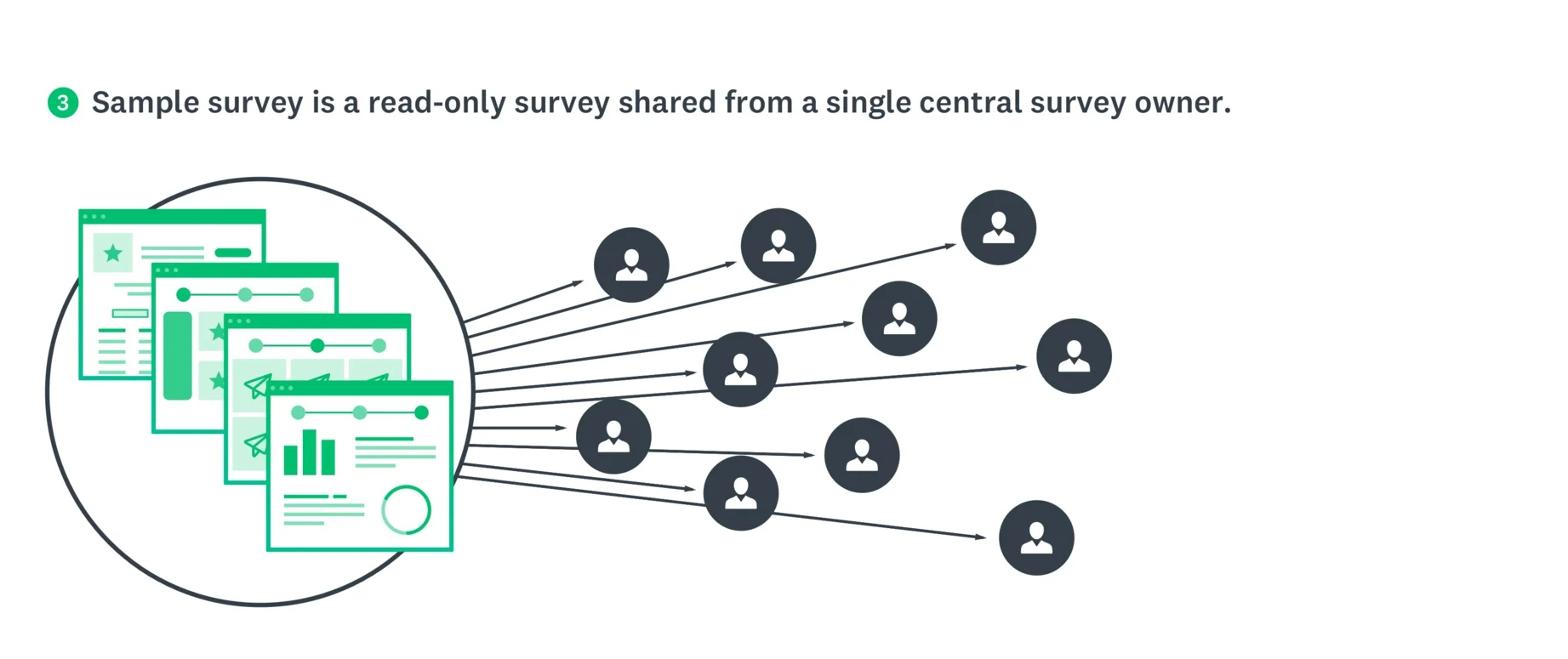
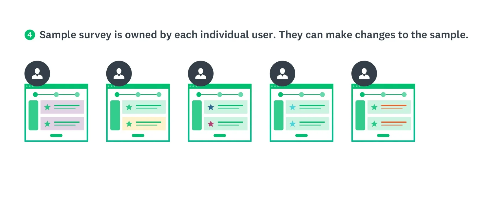
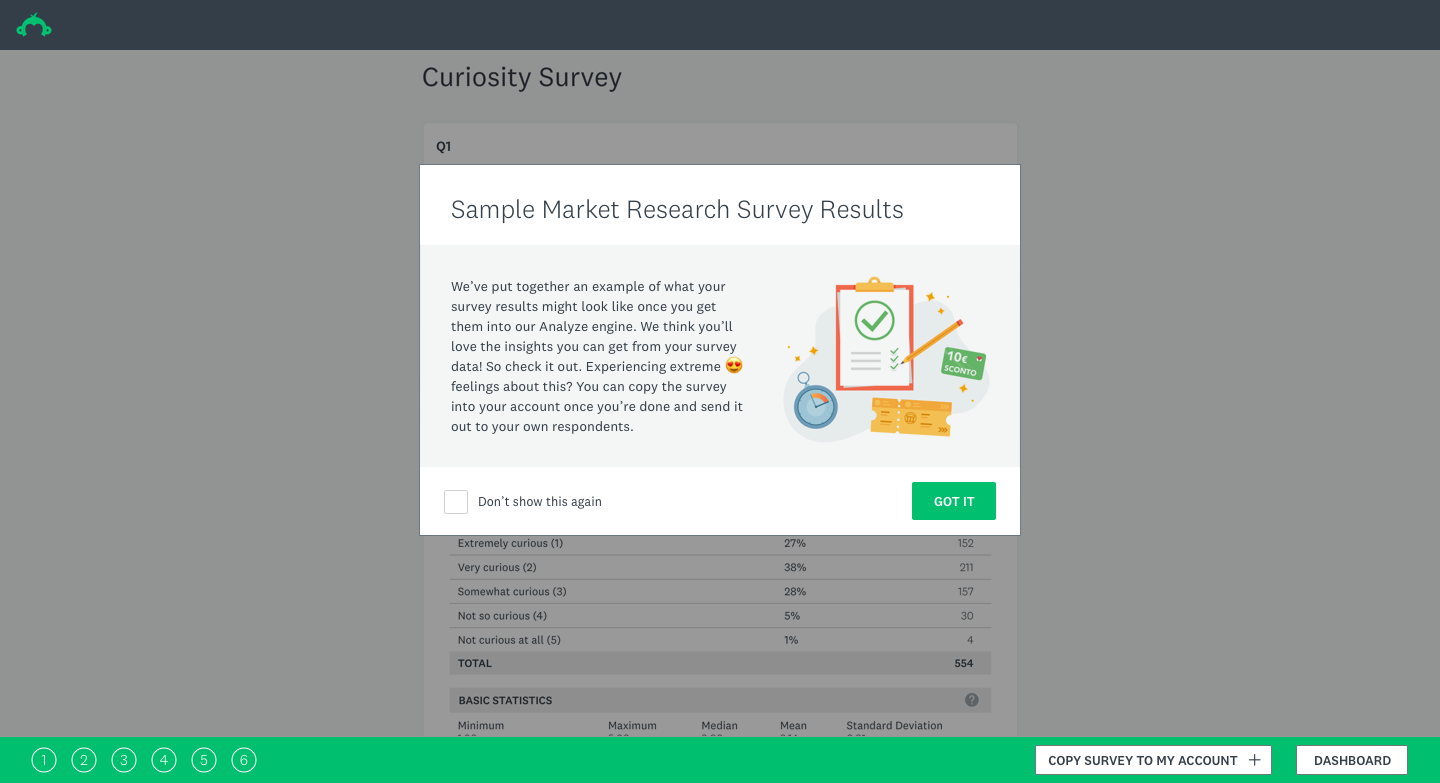
- Will it be read-only or editable? If editable, how much? What are our guardrails? Can the user reset the data to the original data set?
- How can the Sample Survey and Onboarding flows leverage each other to create a richer experience when combined but still stand alone when necessary?
- Would we build a logged out/no account mode? How much will be in scope for the MVP release?
Key takeaways
- Our goal is to help people to see themselves in an example
- Sample surveys should match customers' use cases
- We should help customers understand they need to choose the right question types so they get the data they need (which will help to increase deploy rates and our NPS rating)
- The feature needs to show what kind of insights users can get from survey results
- I needed to design an experience that starts with helping the user identify what it is they want to learn
- The Sample Survey and onboarding experiences should leverage each other to create a richer experience when combined, but still stand alone when necessary
- A marketplace of ideas and examples other customers have agreed to share would be helpful to users
- The narrative should include industry-related insights (e.g. 'This is the NPS benchmark for your industry')
- For future iterations, consider allowing users to see sample results in real time as they edit their surveys
- A video is a key tool to show the value of this
New focus on Survey Gallery
Research made one thing clear: our Explorers didn't need more templates or more prompts to create surveys. They needed to see what the output of a good survey looked like — the charts, the summary tables, the sense that data could be immediately useful. That insight reframed the entire design direction.
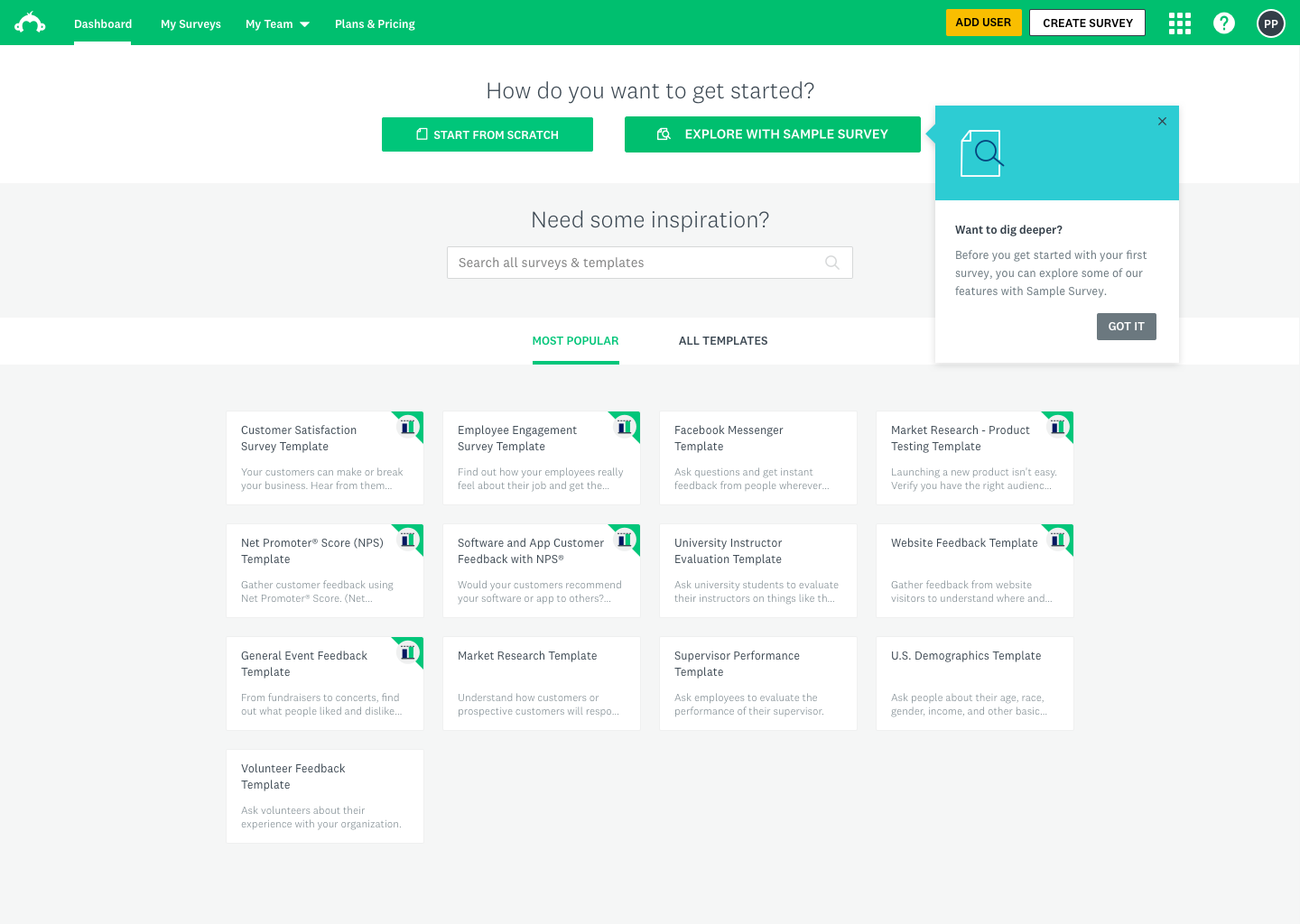
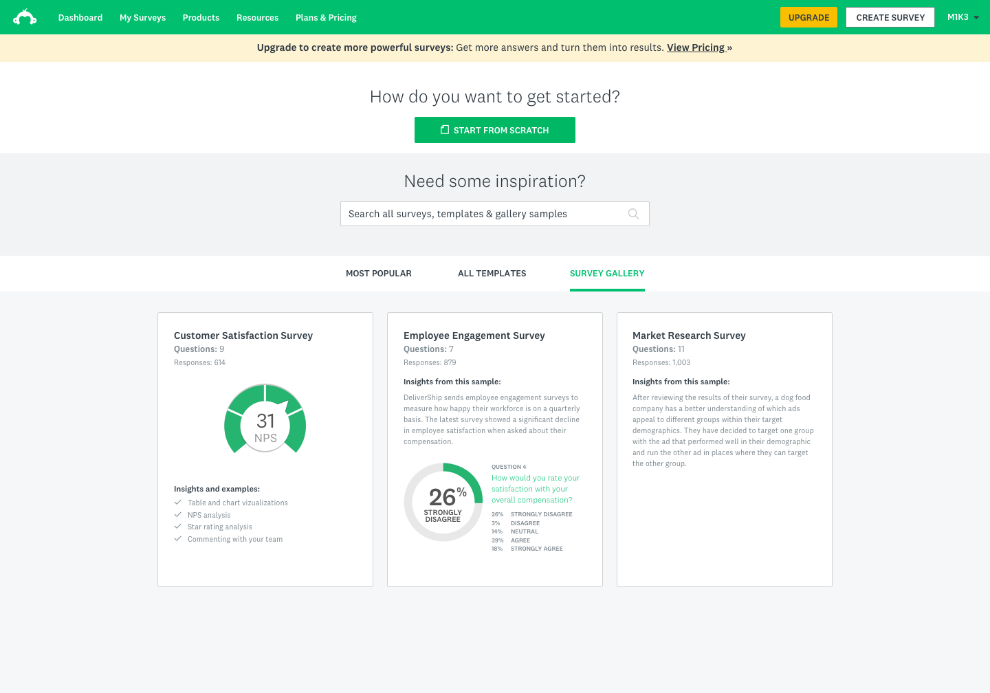
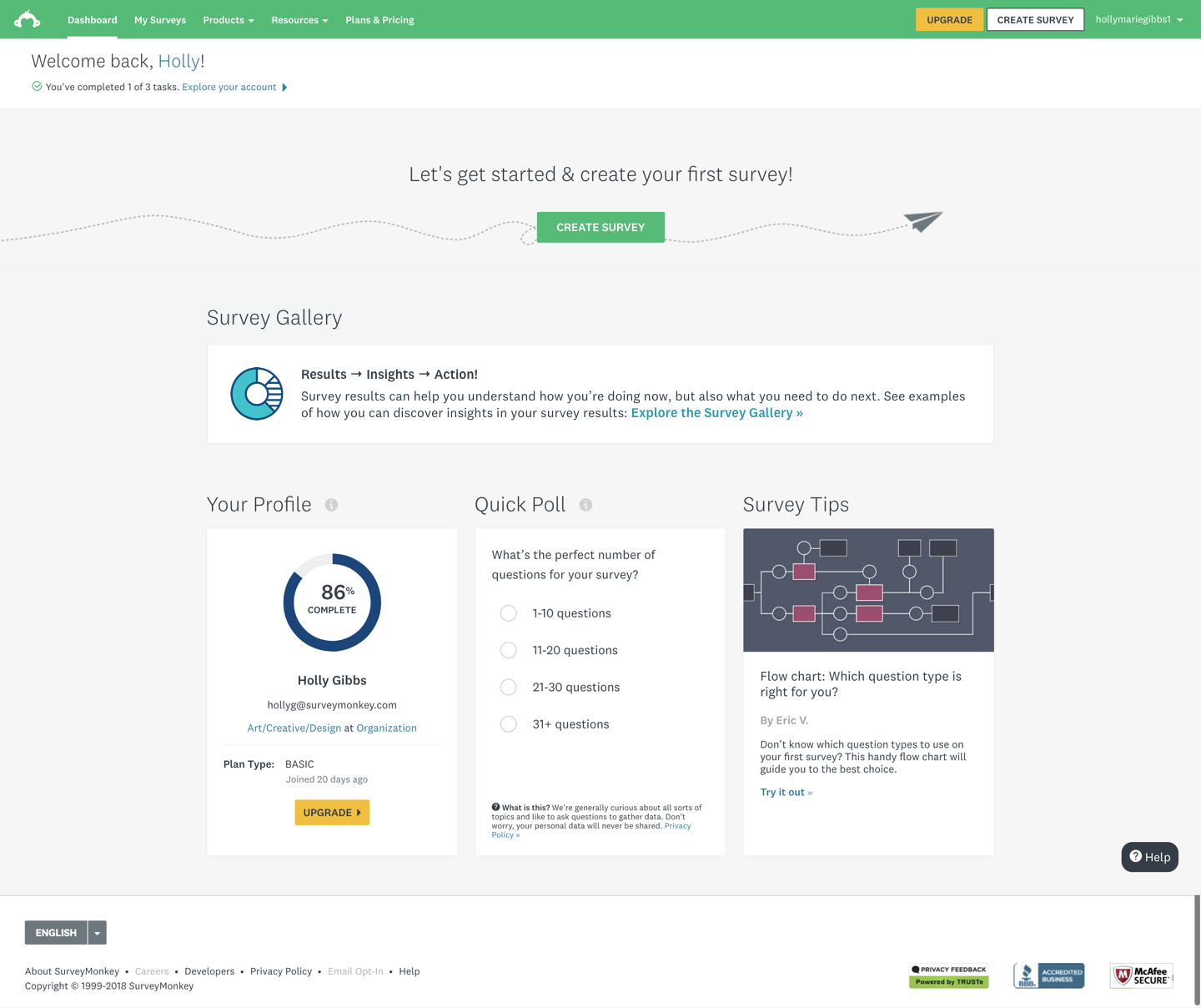
Rather than guiding users toward creation, we shifted focus to creating a curated gallery experience within the dashboard that would let users browse real example surveys with populated results. The gallery would live where users were already spending time — their home dashboard — and offer a low-commitment, high-reward way to understand what the product could do for them.
Scope of designs
The project scope centered on three connected design areas:
- The logged-in home dashboard — surfacing the gallery as a discoverable entry point for users who hadn't yet created a survey
- Gallery tiles and browsing experience — how users would navigate, filter, and select from curated survey examples
- Onboarding and in-product guidance — coachmarks, tooltips, and zero-state designs to introduce the feature to new and returning users without interrupting their flow
Out of scope for this phase: survey creation flows, deep results customization, and personalization of gallery content by industry or role.
Solutioning
Explorations & iterations
Solutioning
Experiment
Our key performance metric was user engagement, where we were hoping to see an increase in deploy rates.
The test was shown to 30%, then 50% during the experiment. Once we reviewed and modeled out the results, we released the feature to 100% of users.
Users who interacted with the Survey Gallery had a 9.2% lift in their survey deploy rates across the board.
Solutioning
Results
The feature launched to 20% of users, and we immediately saw a statistically significant jump in deploy rates.
Version 2 has been specced out, but has not been resourced at this time.

Learnings
- Design thinking workshops are most valuable when they're structured around genuine alignment problems, not just brainstorming. Having clear frameworks (laddering, creative matrix, prioritization) kept the team from spinning in abstraction.
- Testing with the right users early is everything. The Explorer persona only became legible to the full team once we put real Explorer users in front of a prototype and watched them navigate it.
- Showing data is more persuasive than describing it. The single most impactful design decision was making the sample survey data feel credible — once it did, users' sense of the product's value shifted immediately.
- Small surface area, big leverage. The gallery was a contained feature, but because it lived on the home dashboard and targeted a high-volume segment, even modest engagement improvements translated to meaningful business impact.