Mobiquity / Zumba
Zumba® fitness app
Context
UI Designer · 2014
Services: UX/UI design · User & pattern research · User flows · Clickable prototyping · IA · Copywriting · Design pitch to client
Typeface: Brandon Grotesque
Summary of work
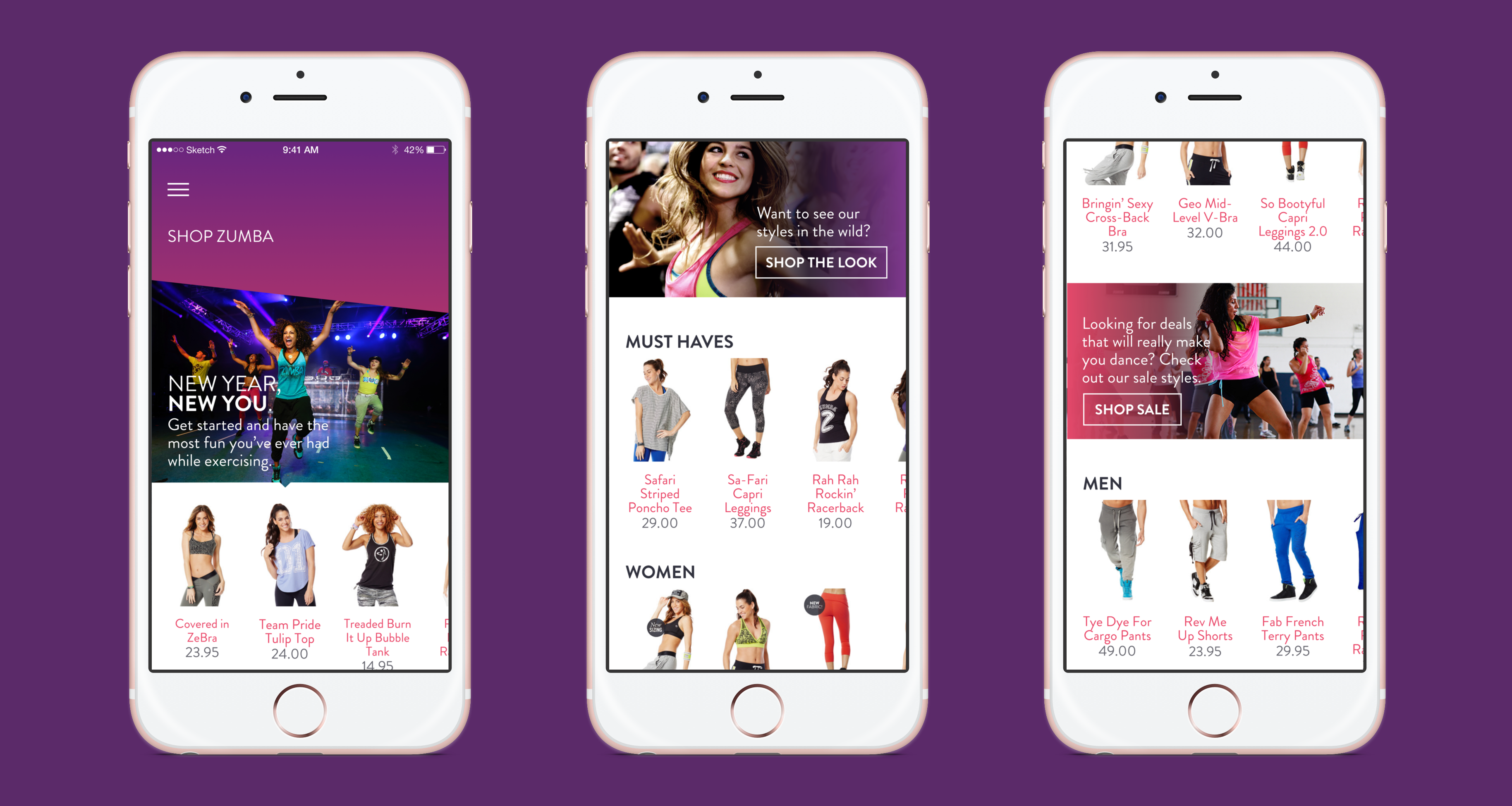
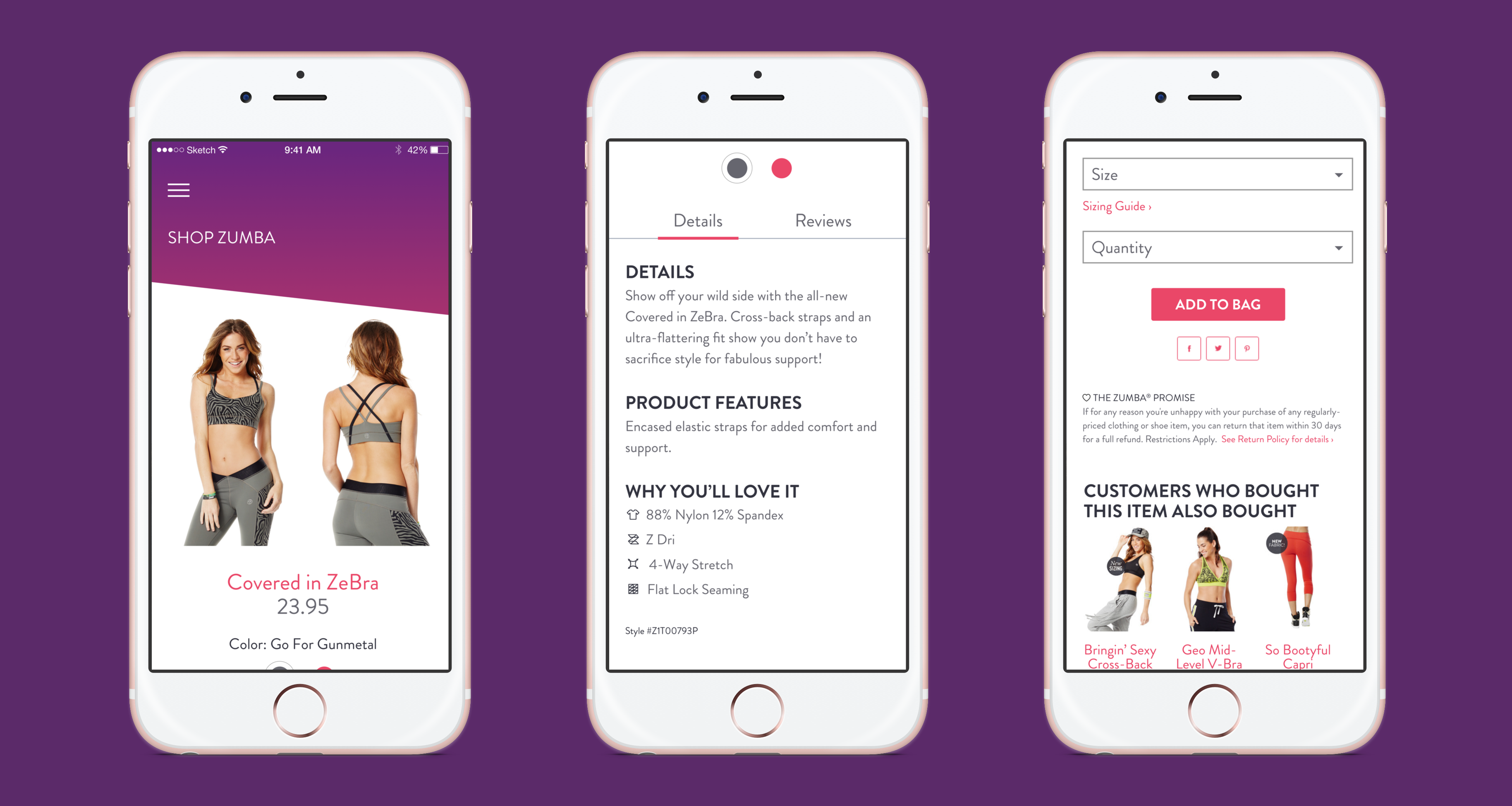
Mobiquity pitched a fitness app concept to Zumba® — the globally recognized dance fitness brand — and I designed the screens for that pitch. The app concept created a social community for both students and instructors, alongside a hub for the company's merchandise store and digital content.
The visual design challenge was bringing Zumba's bold, colorful, movement-forward brand identity into a mobile interface context that still needed to be scannable, navigable, and functional. The result needed to feel unmistakably Zumba while avoiding the clutter that can come from applying a high-energy brand to a UI without restraint.
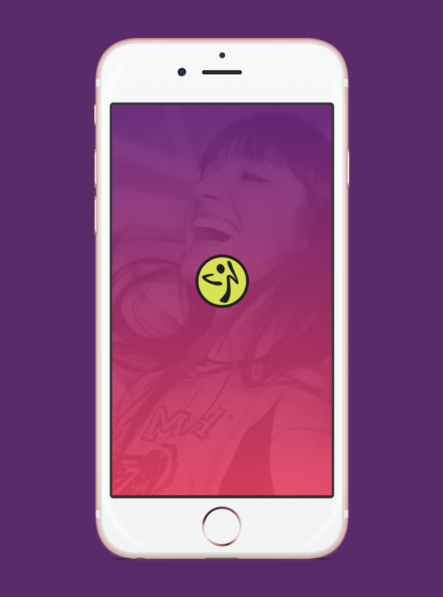
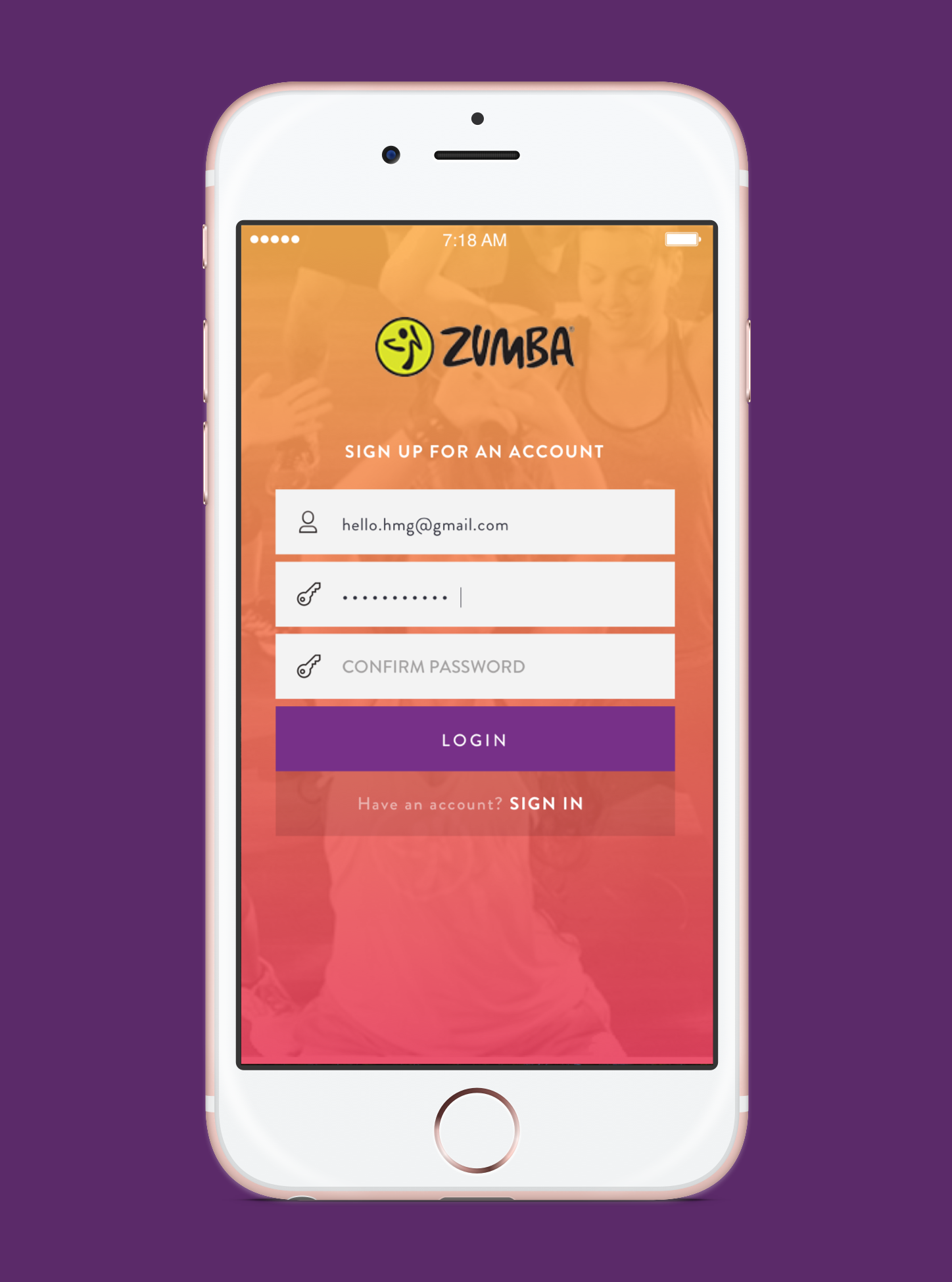
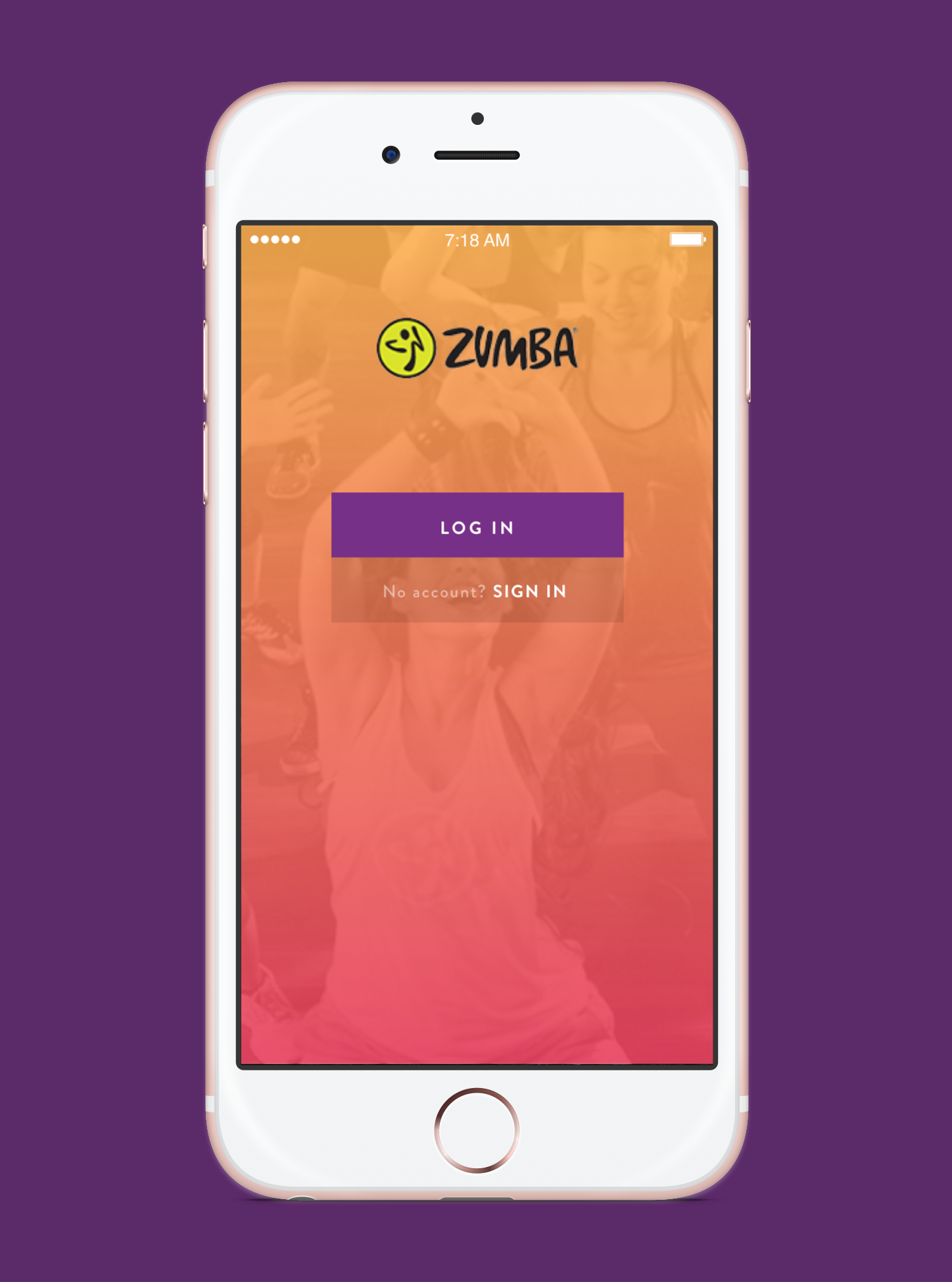
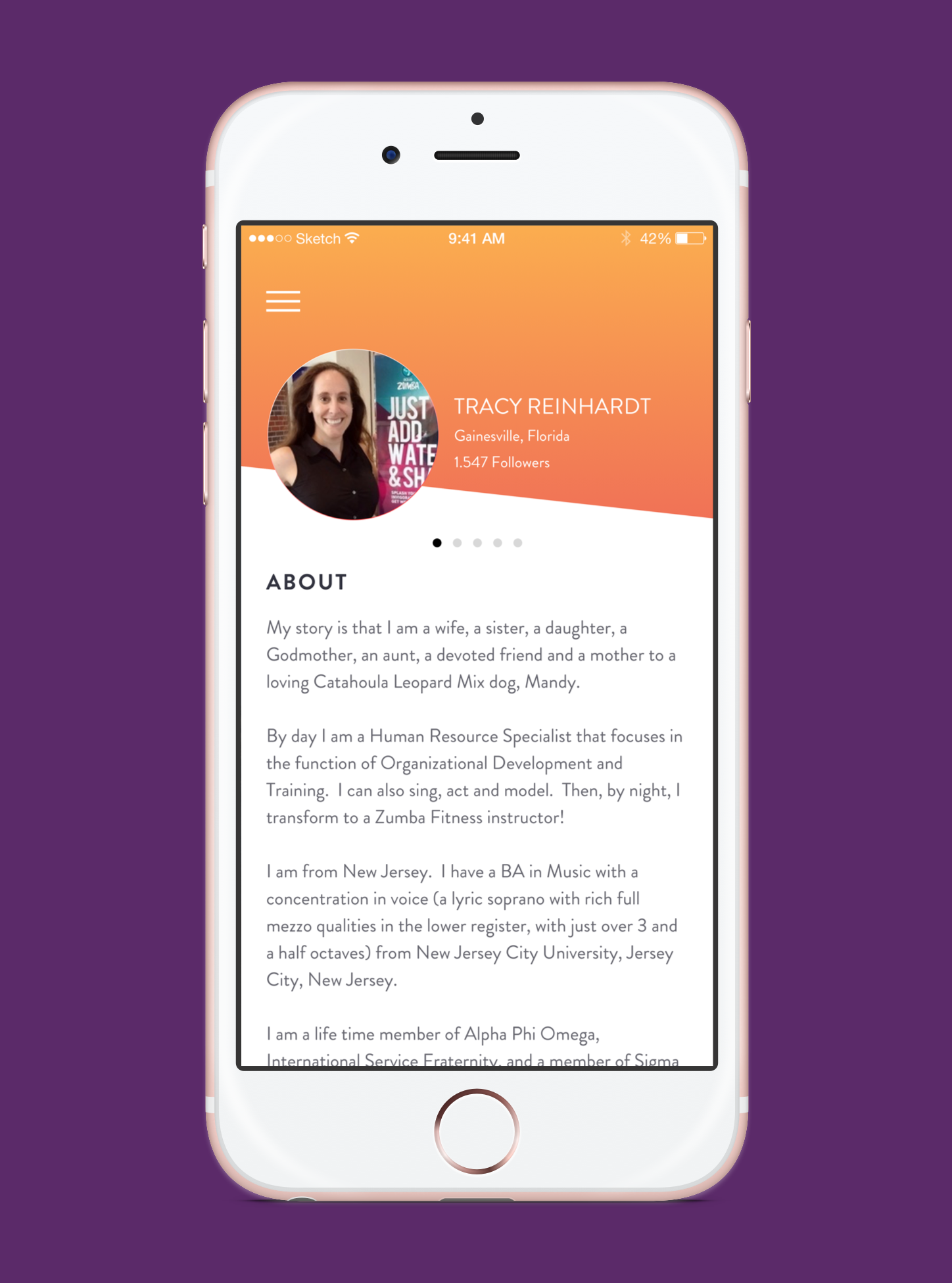
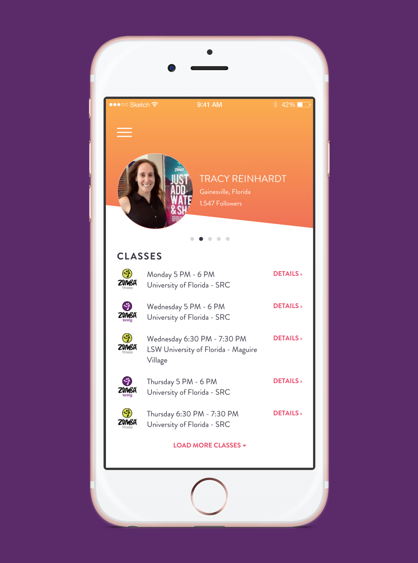
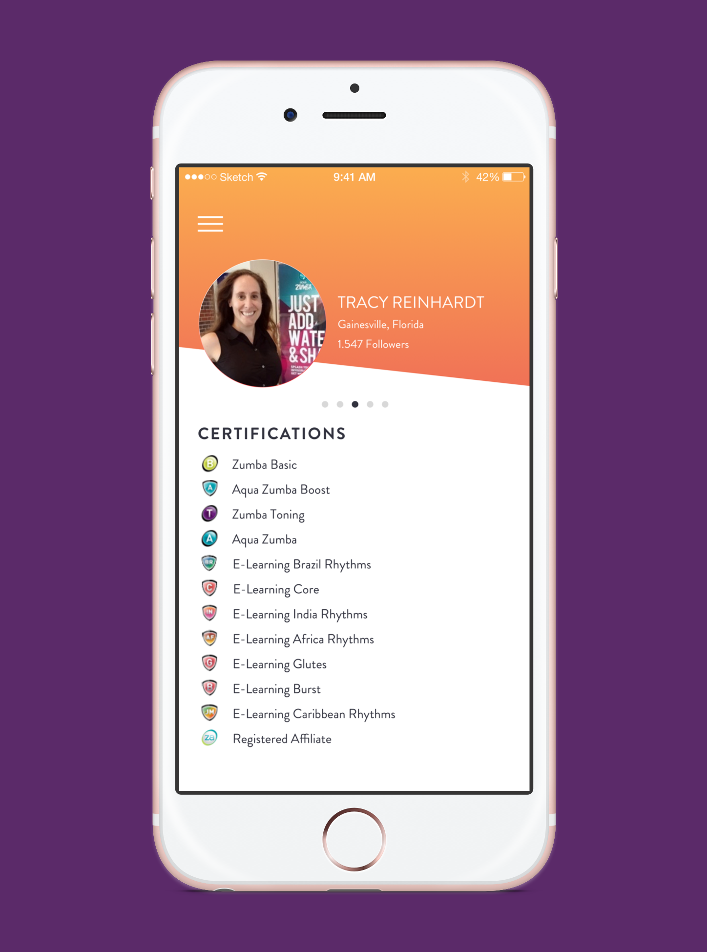
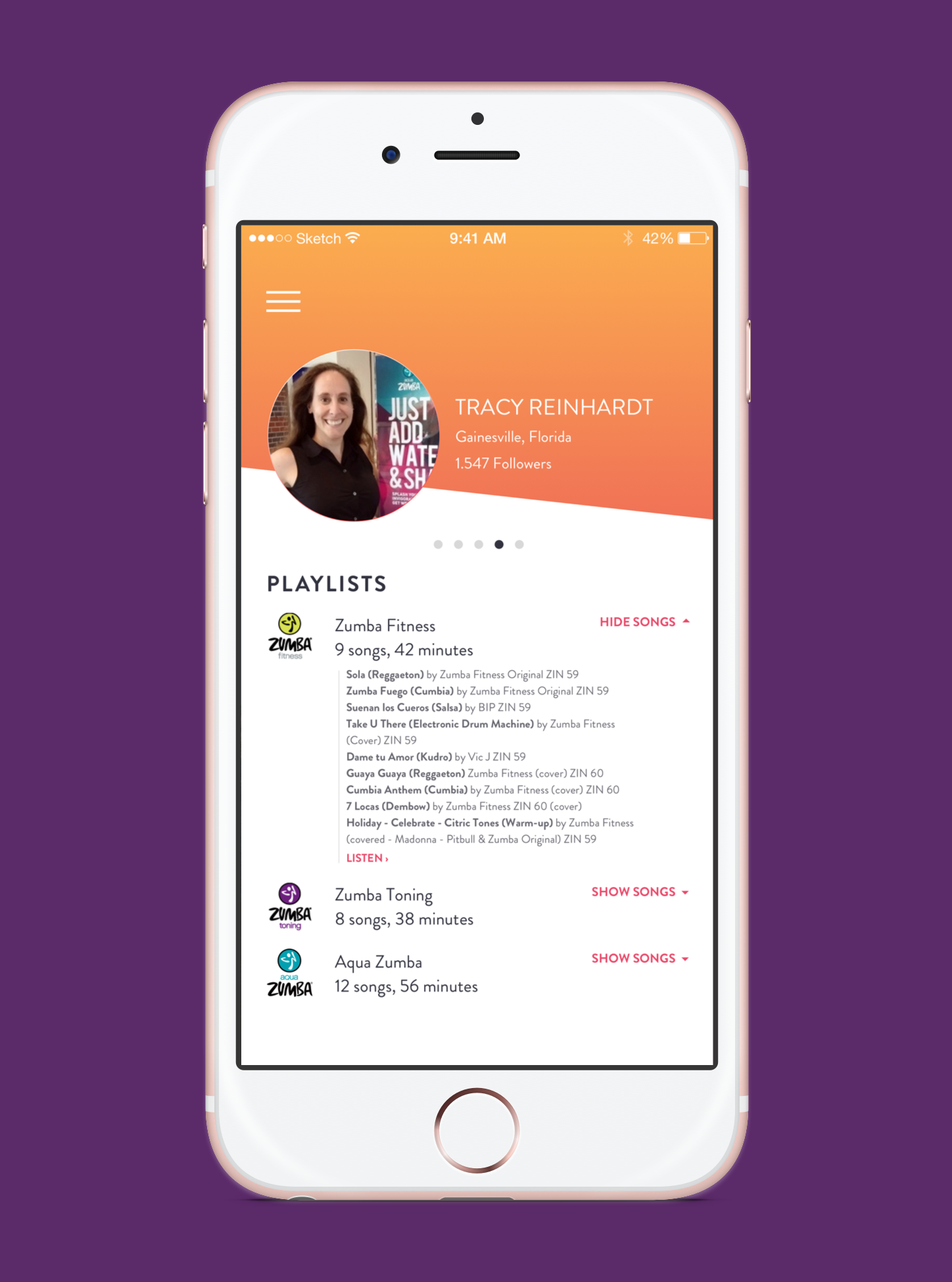
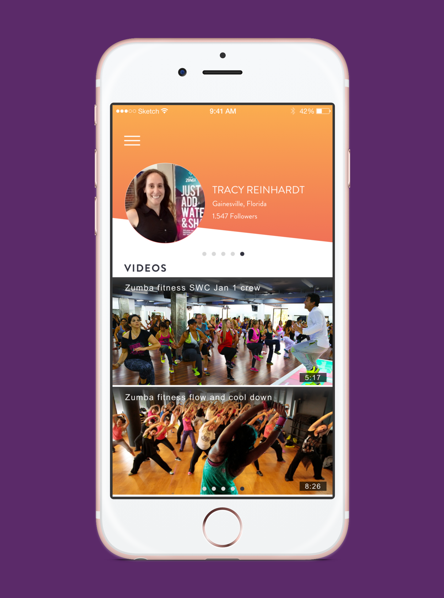
Key surfaces included the class discovery experience, the streaming player interface, the instructor content hub, and the user profile and activity tracking sections. Each surface had its own visual rhythm appropriate to the content, unified by a consistent underlying system.
Problem
Process
The visual design process began with a brand immersion phase — reviewing Zumba's existing brand guidelines, marketing materials, and physical merchandise to understand how the brand expressed itself across contexts. I identified four brand-consistent visual principles that would guide UI decisions: high energy through color, rhythm through layout patterns, warmth through photography treatment, and boldness through type.
From there, I built a component library in Photoshop covering buttons, cards, navigation elements, and content containers, applying the four design principles consistently. Screens were assembled from these components and reviewed with the Mobiquity project manager and Zumba's digital team in iterative cycles.
Outcomes & impact
- The pitch design demonstrated Mobiquity's capability as a partner for fitness and lifestyle brands
- The visual component library built for the pitch was referenced on subsequent Mobiquity projects
- The project sharpened my process for translating high-energy consumer brands into functional UI systems
Learnings
Translating a high-energy consumer brand into a functional UI is a balancing act that requires strategic restraint. Every element can't be at maximum volume — the design needs quiet moments to make the loud moments land. Finding those rhythms within the Zumba brand was the core creative challenge of this project and one I'm proud of how we solved.