Mobiquity / PLI
PLI mobile app
Context
UX/UI Designer · 2014
Services: UX/UI design · iOS · User & pattern research · User flows · Clickable prototyping · Iconography · Design reviews with client
Typeface: Proxima Nova
Summary of work
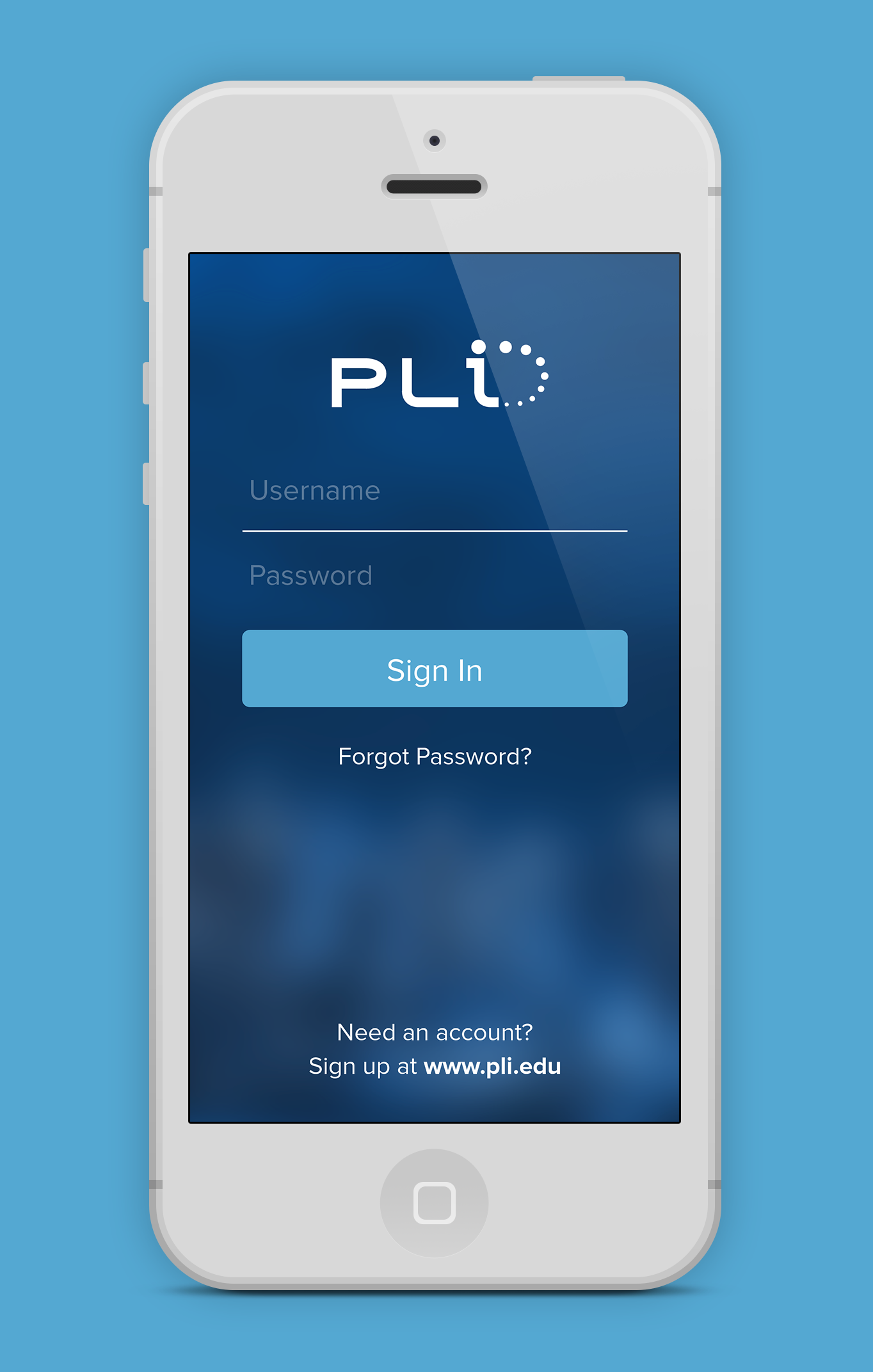
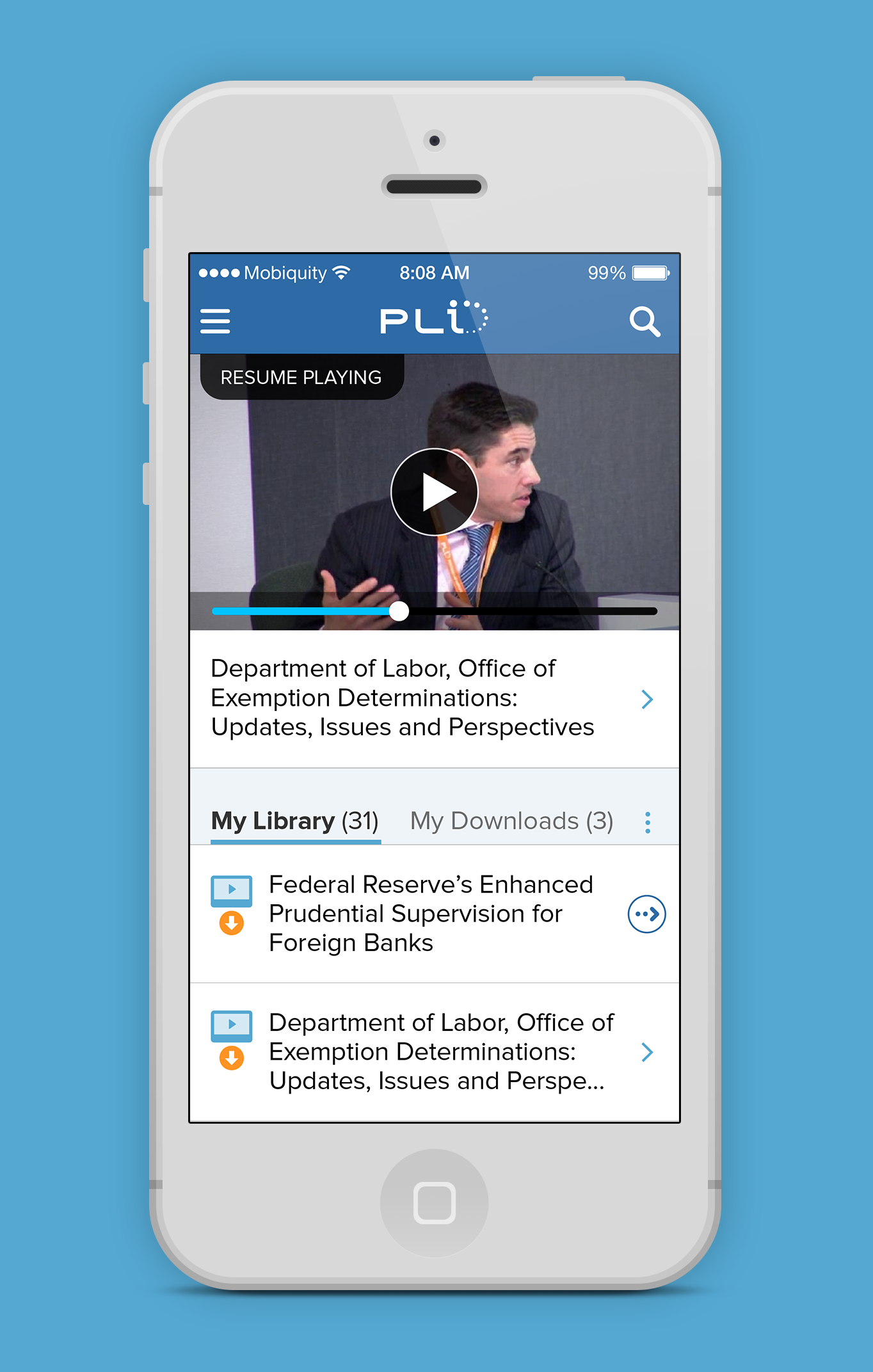
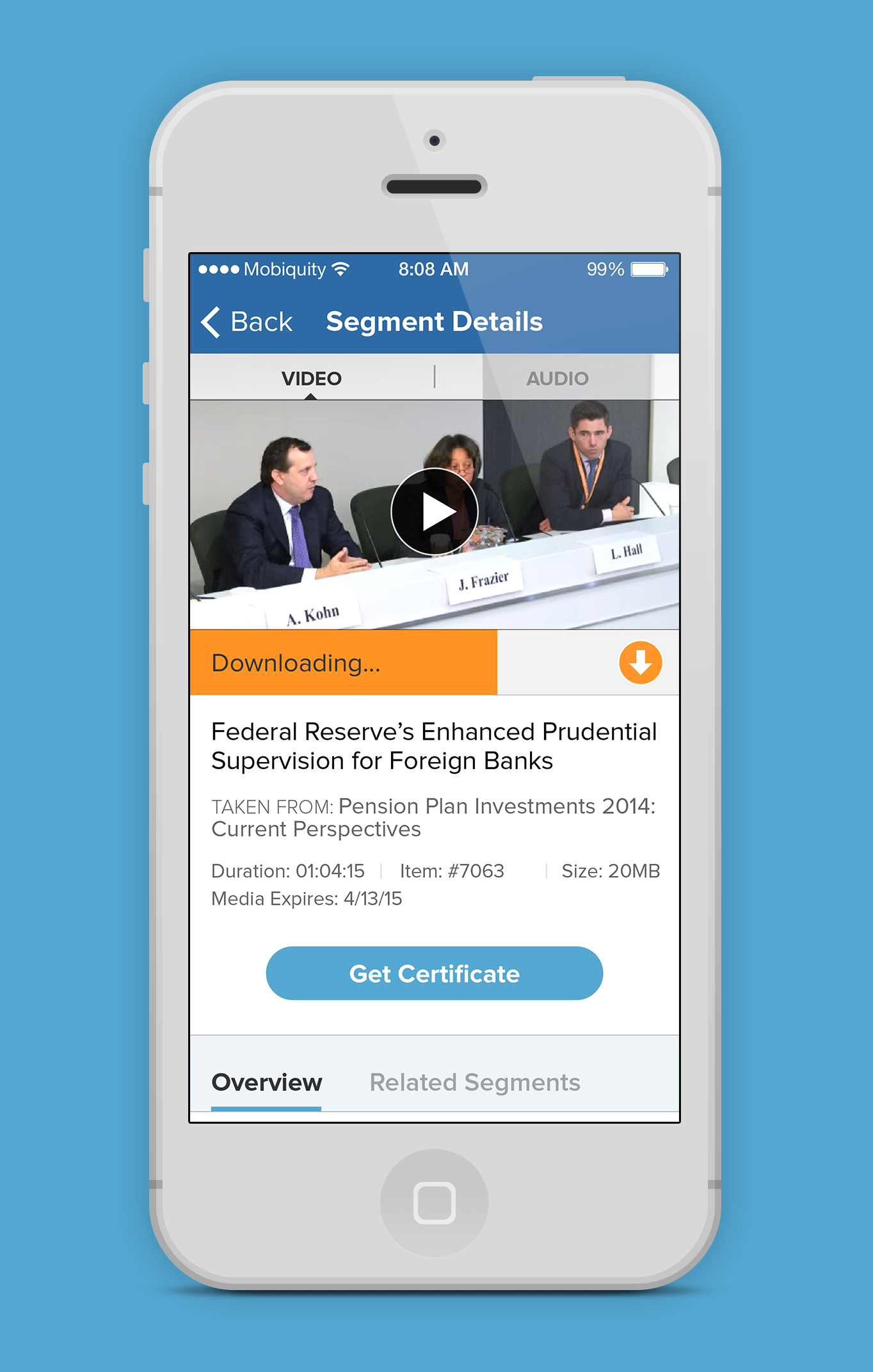
Our team worked with the Practising Law Institute (PLI) to revamp their app, designed to give customers easy access to their audio and video content. Users can select audio or video products, stream media while online or download files to their devices for offline review, and access related materials — making it a complete on-the-go resource for legal professionals pursuing continuing education.
The visual design needed to feel appropriately serious and professional for a legal audience while remaining genuinely pleasant and efficient to use. The resulting design used a restrained, editorial aesthetic: clean typography, a conservative color palette anchored by PLI's existing brand, and a content-forward layout that put course materials front and center.
Problem
The PLI app was outdated and difficult to navigate. The client wanted a design and architecture refresh that would make it easier for users to access content while traveling. The backend team also worked on optimizing their data structure to reduce load times within the app.
Process
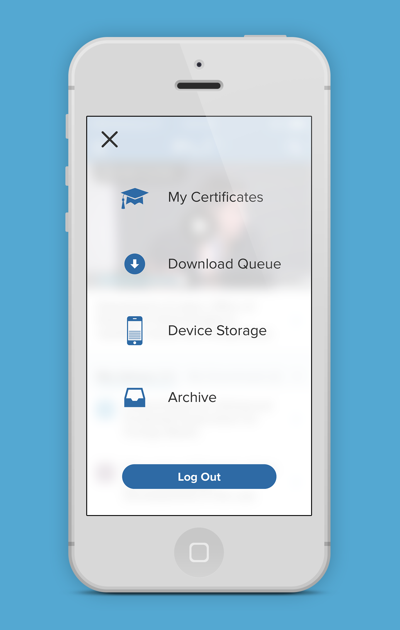
We worked through several iterations before landing on a final direction. The biggest change was a complete reorganization of the app's structure — running through user flows to eliminate dead ends and surface hidden content. We simplified navigation to four main entry points and designed custom iconography to give users clear visual cues throughout.
The design process started with an analysis of PLI's existing brand and print materials, which had a polished, professional character that needed to translate into a mobile context. Component development prioritized the content browsing and course player experiences, as these were the surfaces users would engage with most frequently.
Outcomes & impact
The integration of the certificate application process after completing materials made the app a one-stop resource for users pursuing CLE certification. The refined navigation and simplified interface allowed for easy movement throughout the app.
- Content library browsing significantly improved on the mobile web experience users had previously relied on
- The design system established a clear visual language for PLI's future digital product work
- View the app on the App Store →
Learnings
Designing for professional audiences is a valuable exercise in restraint and precision. There's no place to hide in a conservative, content-forward design — every typographic choice is visible, every color decision is legible, every layout decision is immediately apparent. That pressure is uncomfortable and ultimately clarifying.
Our members expect the same rigor from our digital tools that they bring to their own work.
This project reinforced my appreciation for editorial design principles in digital interfaces. The best news and magazine design traditions — clear typographic hierarchy, generous white space, purposeful imagery — translate extremely well to content-rich apps, and I've brought those principles with me into subsequent work.