Wufoo Form Manager UX & UI Refresh
+ User & pattern research
+ Usability & validation testing
+ IA
+ Visual design
+ Design system component development
+ In-product pattern library & style guide
+ Prototyping
+ Motion and interaction design
+ Eng specs, hand-off and support
The Wufoo platform hosts a feature-rich form builder, data management and analytics tools. While the functionality of the product does a lot of heavy lifting, the visual design and user experience had not been updated in many years. The product team's goal was to create a better user experience as well as highlight some of the powerful tools already available to users that they may or may not be aware of.
Typeface: National 2 (custom typeface adapted from National)
Status: This project is currently live. Visit Wufoo's website and sign in (or sign up) and select the Beta experience in the user menu.
Problem
The Wufoo product experience was rich with features and functionality, but only a small set of power users were utilizing its full power. We needed to update the in-product user experience not only to match the logged-out experience better, but also to help users navigate the product and discover tools that currently exist within the product but have low visibility.
Because the Wufoo product has been on the same tech stack since it was originally built, the engineering team decided to pair the codebase update with the UX & UI refresh project.
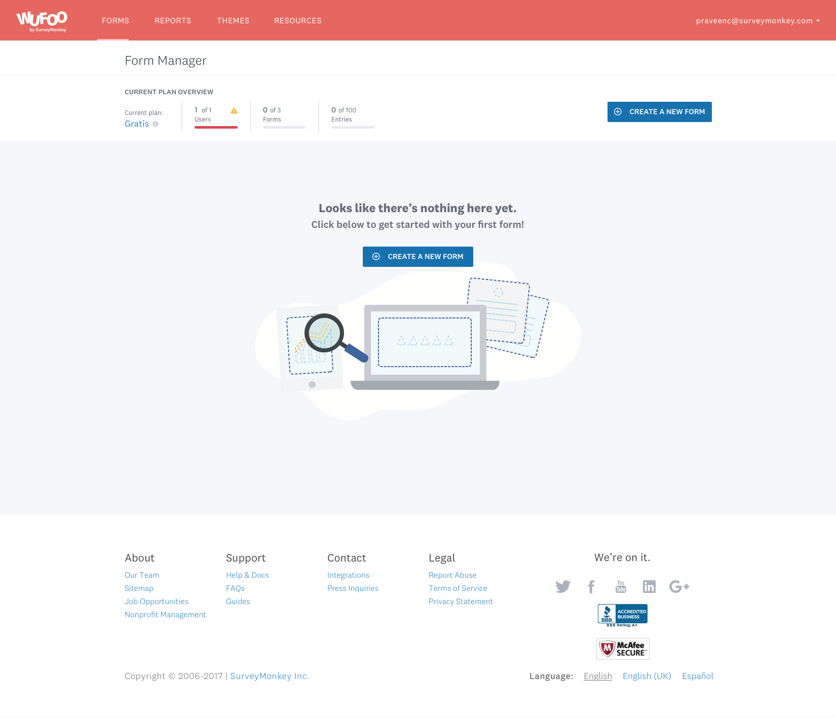
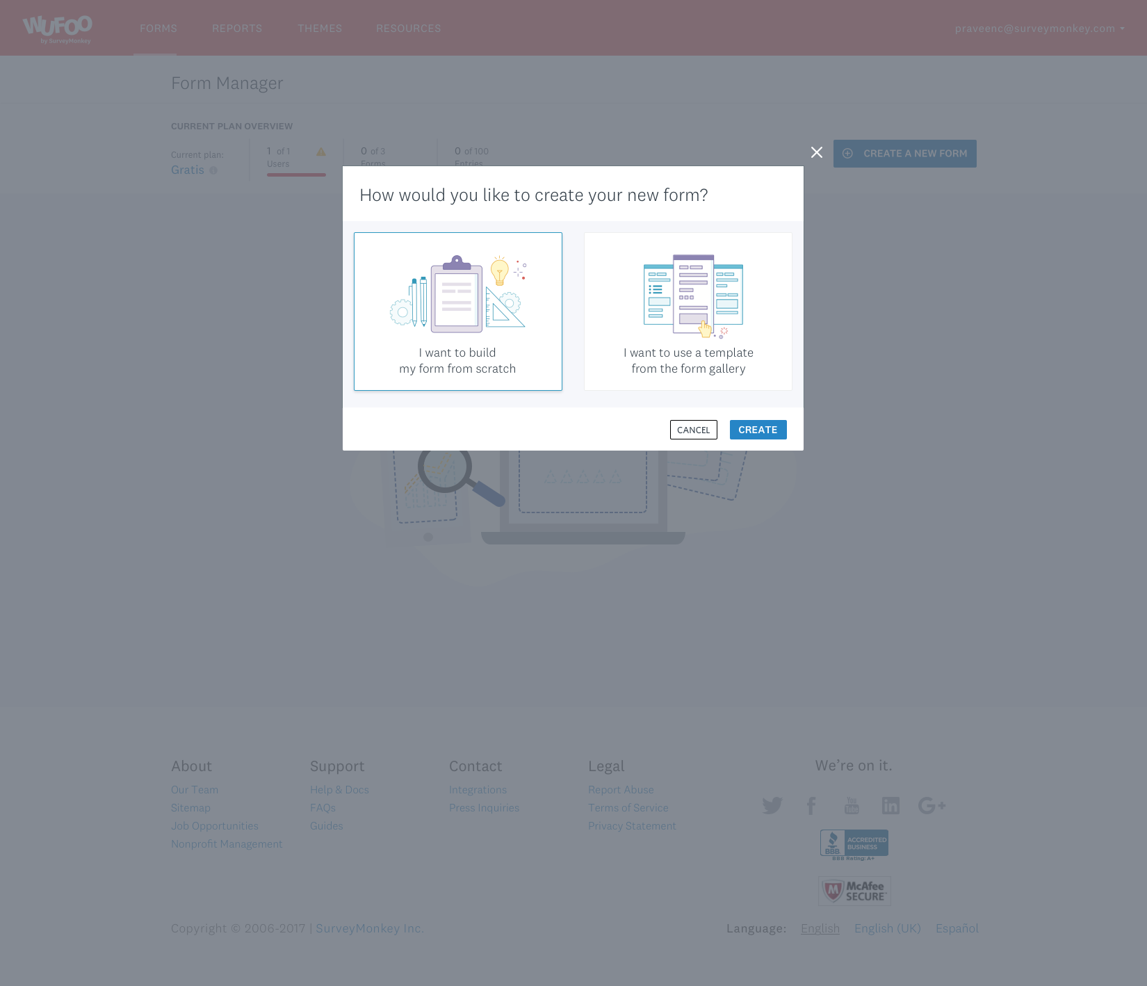
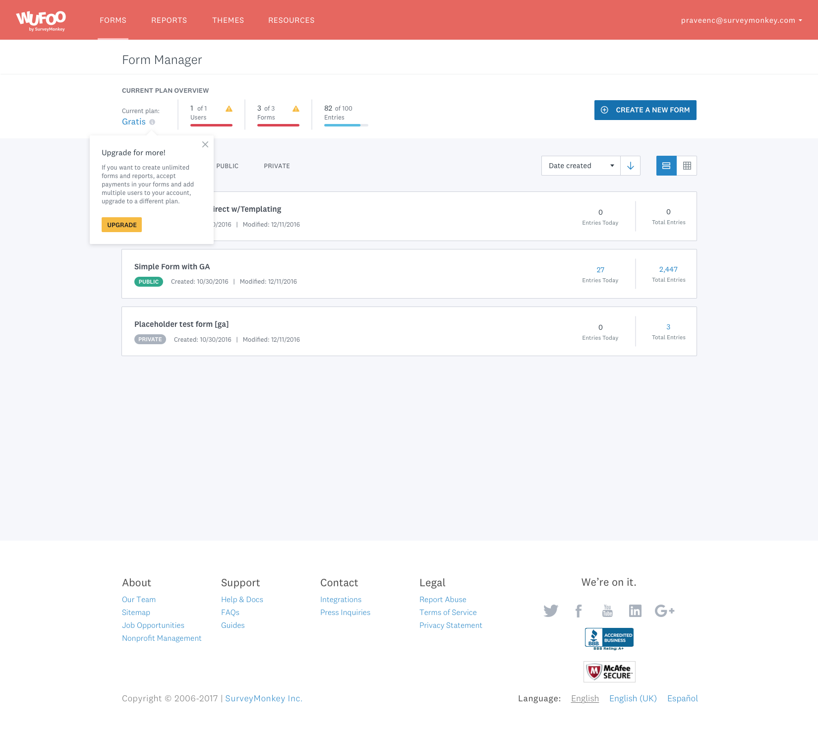
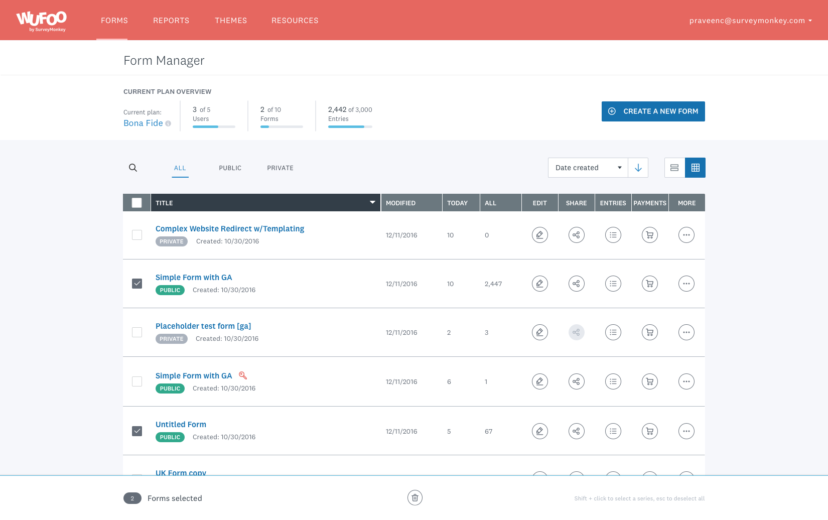
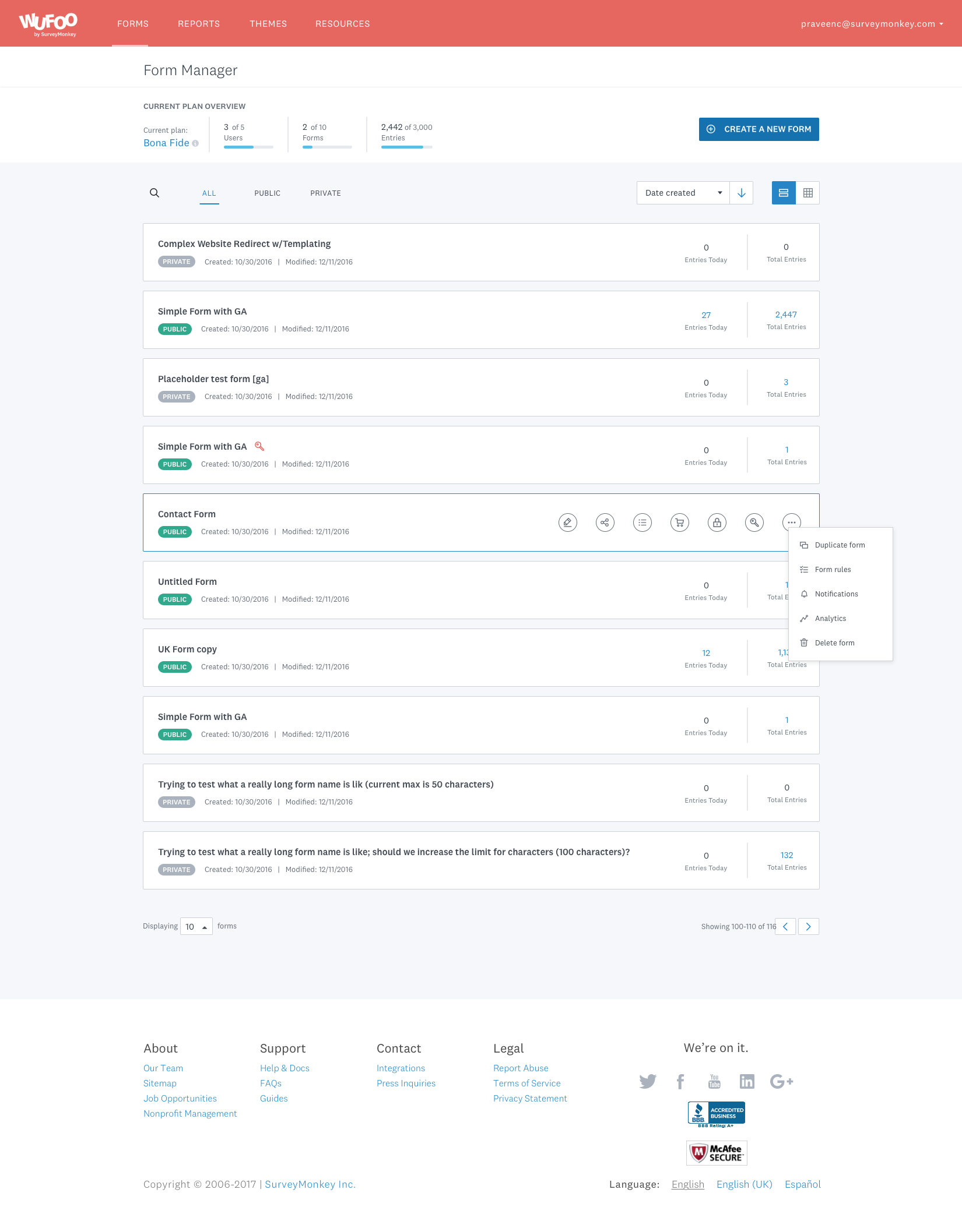
Form Manager dashboard legacy experience
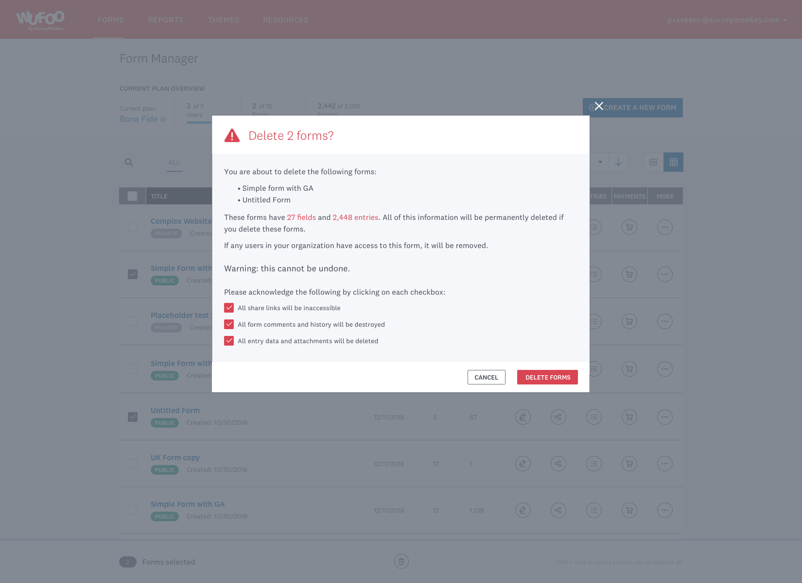
Form sharing interface
API information and mapping
Process
Our product team had several goals when they initialized the refresh project. These goals included increasing discoverability, updating the codebase the product is running on, and demonstrating Wufoo's continued commitment to building and iterating on a product our users love to use. In addition to these, I had some very specific goals I wanted to accomplish during this project from a design perspective.
Design Thinking Workshop
Our project kicked off with a two-day design thinking workshop, where our team worked together to identify our product's North Star and lay out our roadmap for the next few months. The product owner and I guided our team through design thinking exercises with distinct goals: To prioritize what we would work on during the following months, to developed a common language when it came to talking about our product, to introduce the team to the practice of design thinking, to understand our users and customers better, and to create clarity and alignment on our business vision & opportunities. Because our team was mostly new to the product or company, we also wanted to help forge some connections and build up trust between participants.


Research
I wanted to build a foundation for usability research and user testing moving forward and help the team to begin prioritizing it when making product roadmapping decisions. The team didn't have a database of users that had opted in to help with research and testing, so every time they initialized a test it was as if they were doing it for the first time. I wanted to reduce user fatigue during this process as well as establish a group of users we could rely on for suggestions and feedback as I worked to incorporate more testing into our process.
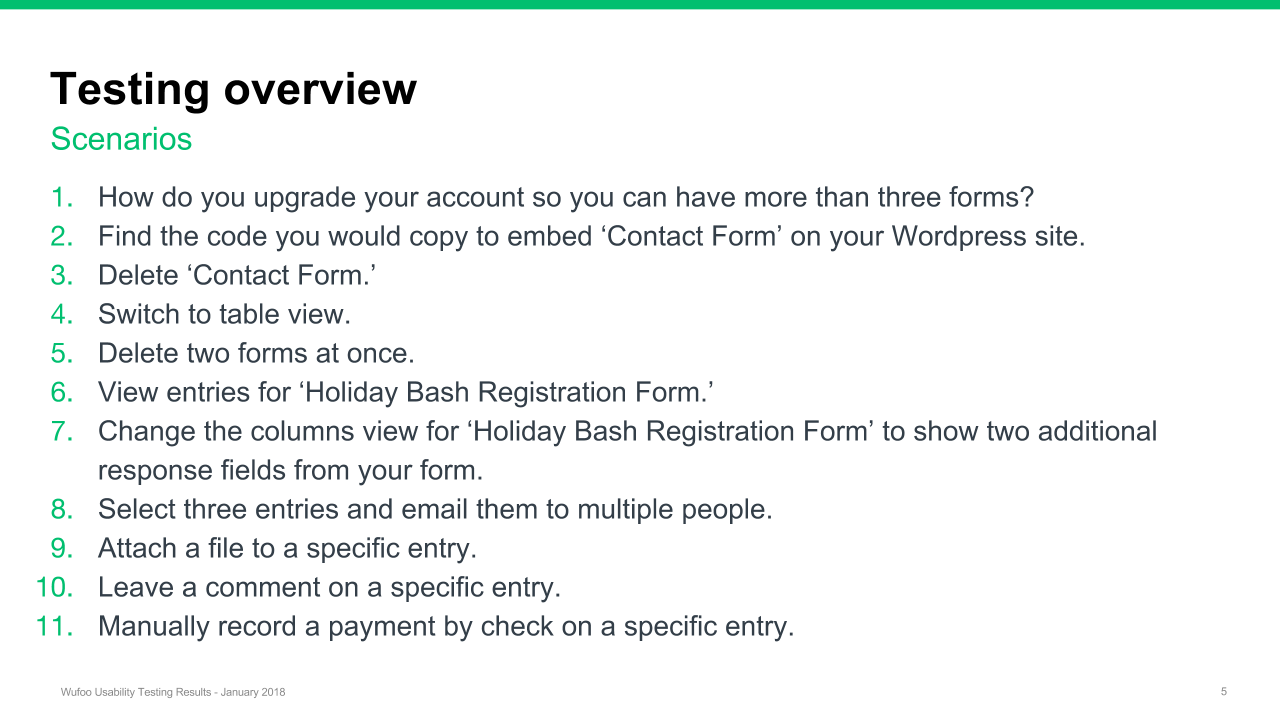
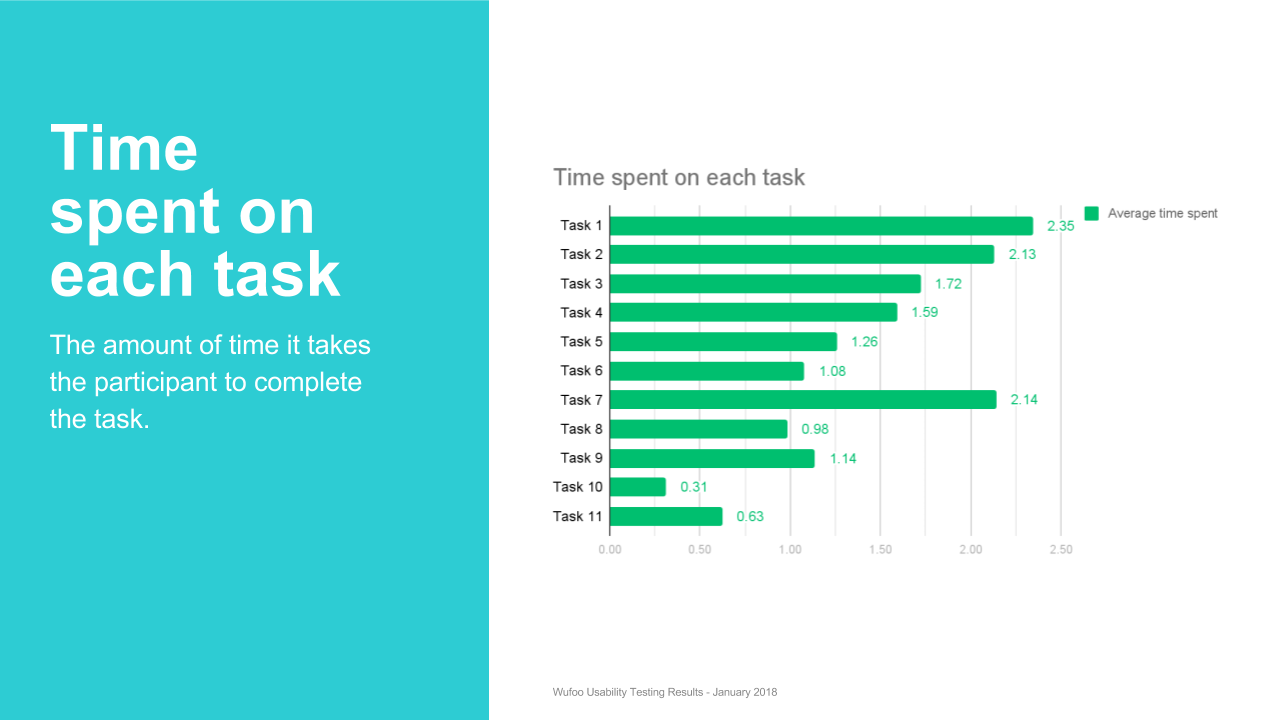
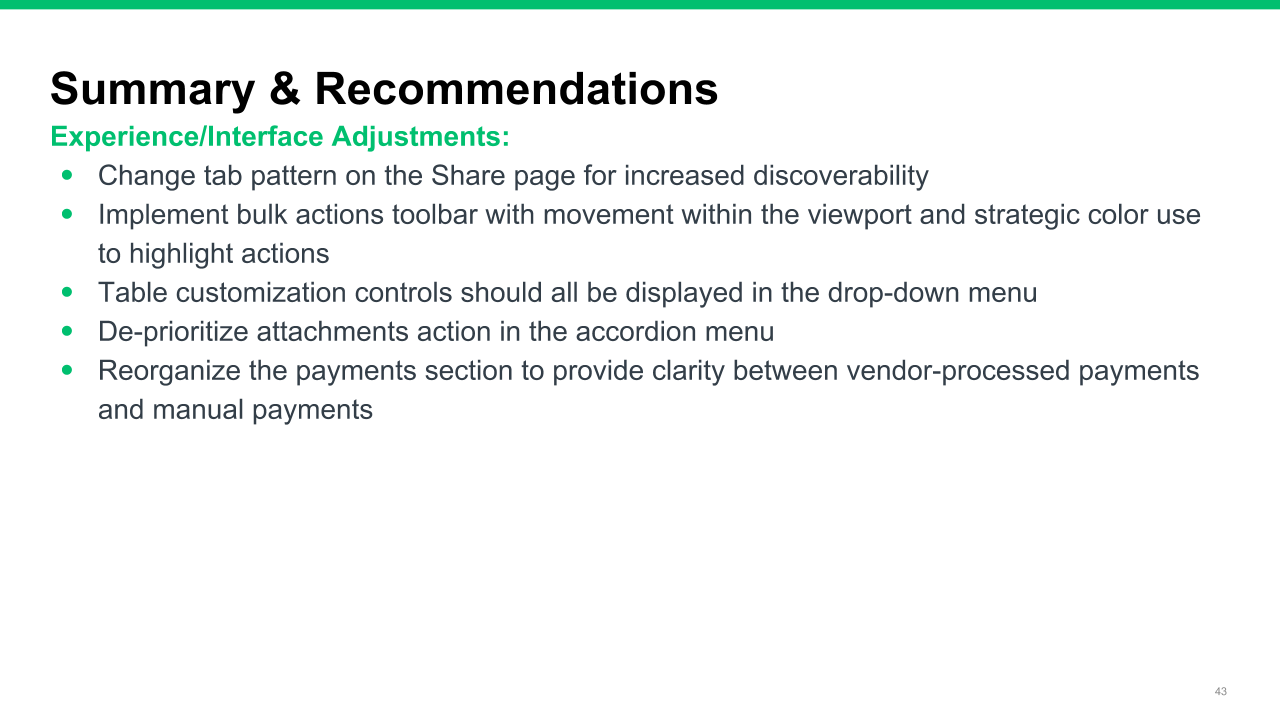
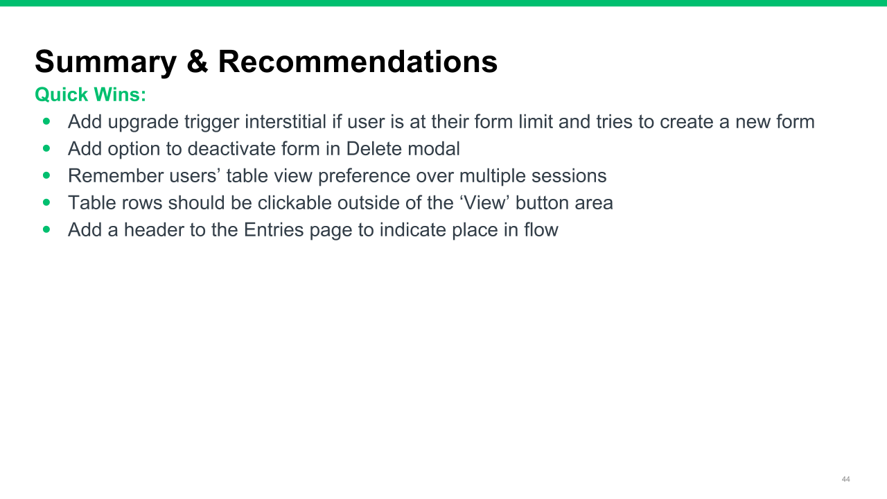
To kick this effort off, I designed a usability study where I had participants run through several scenarios in a prototype. My objective was to present the revised UI experience to both current and new Wufoo users to capture qualitative feedback into how people are using Wufoo and why. When the testing was completed I presented the findings to the product team, along with a list of recommendations that was broken down into quick wins and experience/interface adjustments.

Usability & Accessibility
One of our product team's goals is to become HIPAA compliant, so I knew I'd need to work to bring the Wufoo product up to par in terms of current usability and accessibility requirements and recommendations. In its current state there were areas of the product that met requirements with a score of AA Large or better, but the entire experience was not compliant. I did a complete product audit and targeted both quick wins (the contrast of our text color on backgrounds) and a long-term plan to make the product completely accessible.
I also performed a usability and accessibility analysis to assess the experience's current state and what adjustments we needed to make with the new designs. Some of the changes were made — darkening the link color from our brand blue to one that passes contrast tests for accessibility — while some recommendations were added to the roadmap for consideration in future iterations of the product.

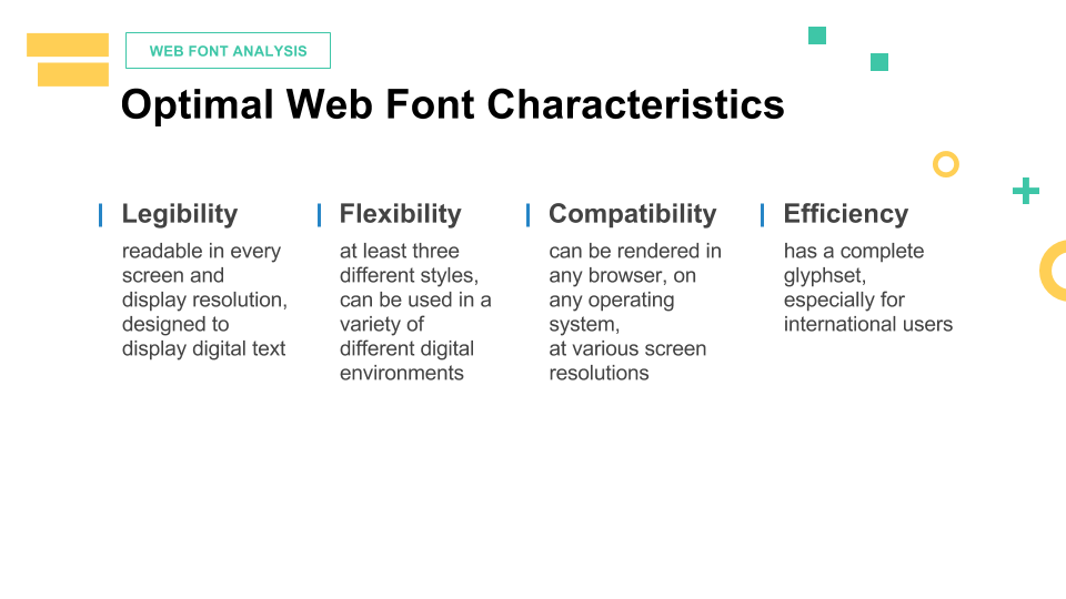
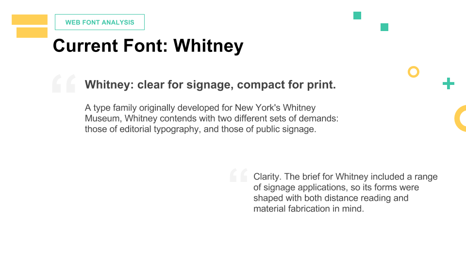
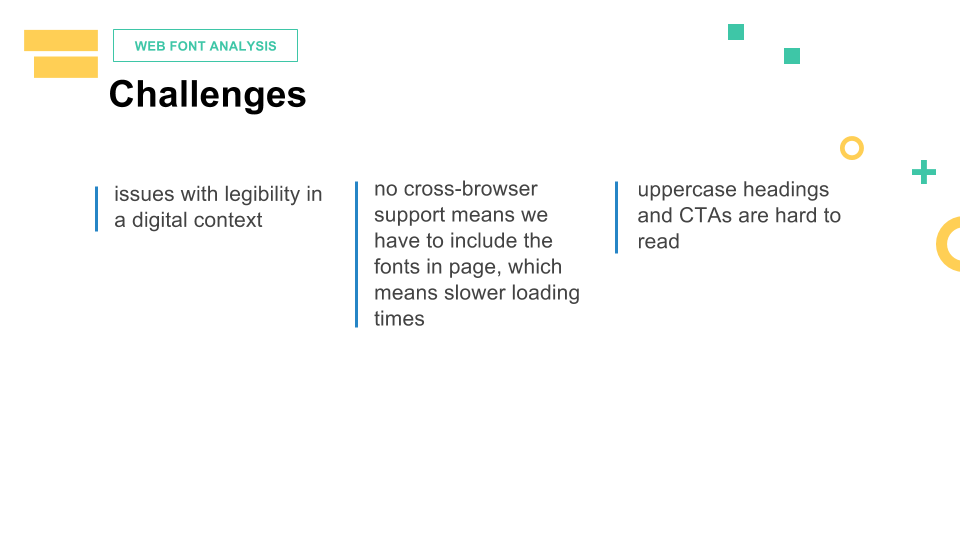
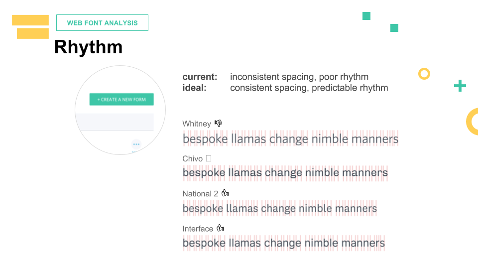

In-Product Typography Analysis & Update
As I worked through the revision of the UI and began to build the designs off of our company's pattern library, I started to have concerns about our brand font, Whitney, in a digital context. After doing some research on the current typeface and web typography standards, I began analyzing several in-product fonts and prepared an in-depth analysis of them for data density display optimization. This led to a decision to change the in-product typeface to National 2, the same one used by the other SurveyMonkey products. This move allowed us to align with the core product and utilize the design system components that were being built out and beta tested.
Migration to Design System Library & Codebase
In order to buy some runway for experimentation, testing and the horizontal projects I wanted to add to our product roadmap, I knew we needed to work on the foundation of the product itself. I wanted to utilize the design system our team had been building out over the last few months, but there wasn't yet a scalable model for portfolio products to use the components the system provided. I worked with Mike on creating a portfolio product model that allowed us to utilize the key components of version control and the core Sketch library with a separate variable file that adapted the core elements for Wufoo's specific styles. I later worked with the Design Systems team to propose, test and incorporate several of the patterns I designed for our team's product experience into the core set of patterns.
This accomplished several things: It allowed us to operate on the same codebase as the core SurveyMonkey product, so we could borrow resources and utilize the same infrastructure support the rest of the company had. Because the Design Systems team had been working on building out React.js components for each of the elements of the system, we were able to make quicker work of prototyping and iterating. This also allowed us to focus on solving new, product-specific problems instead of trying to reinvent the wheel every time we rolled out a new feature, since we were able to build on some of the experiments and testing data already performed for other products within our platform. It gave us greater consistency between the Wufoo & SurveyMonkey products so even new users had an experience with a recognizable platform of products. Lastly, it allowed us to build out a more robust design system that could solve for many problems across a wider spectrum of products.

New design system pattern integration documentation for the engineering team
Results
The project is live in the product after the release of the Form Manager Beta project, which was quite successful in terms of feedback as well as the number of Beta group feature and improvement requests addressed. To view this experience, sign up or log into your Wufoo account.