Mobiquity / Weight Watchers
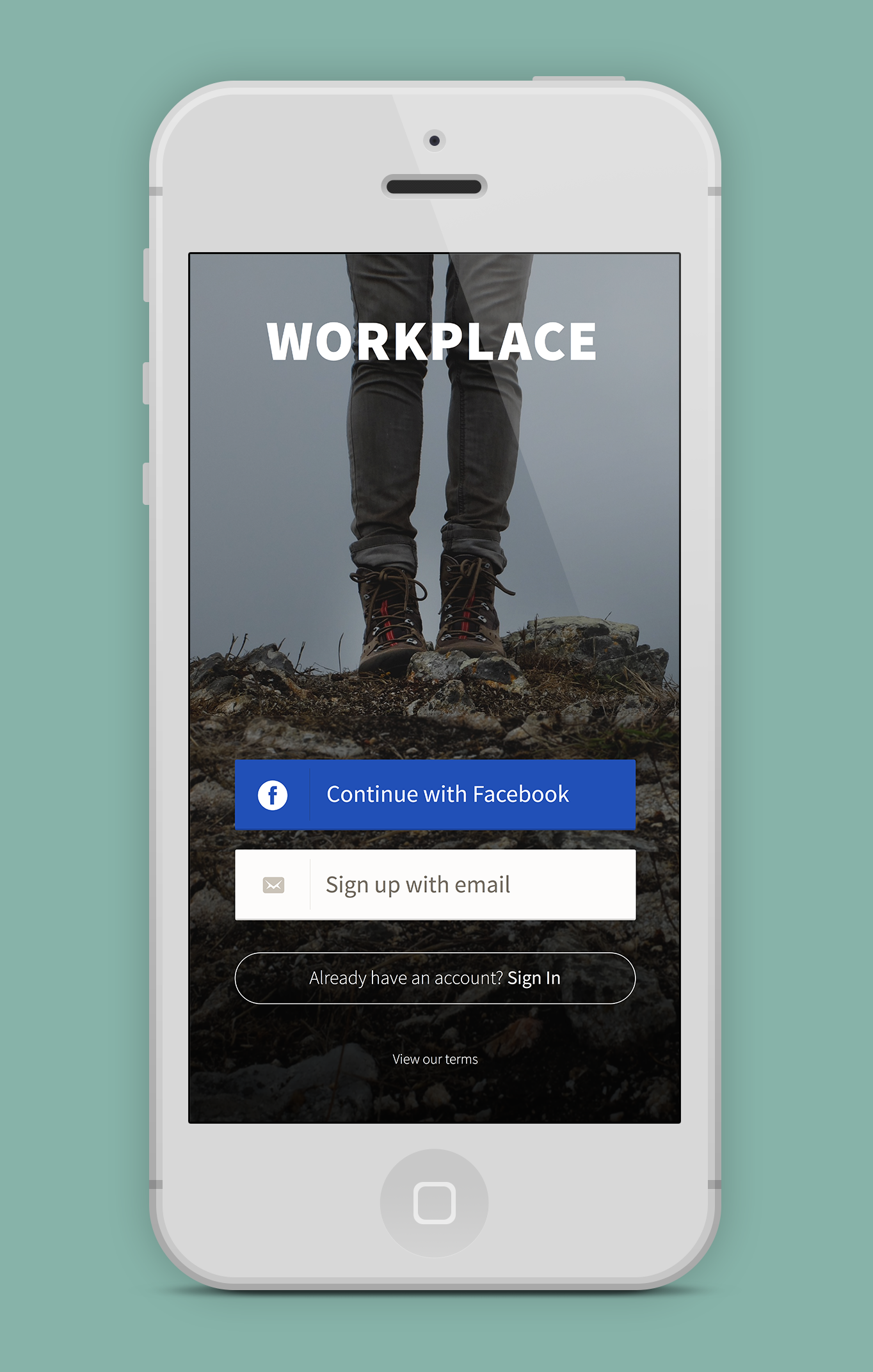
Workplace by Weight Watchers
Context
UX/UI Designer · 2014
Services: UX/UI design · User & pattern research · IA · User flows · Iconography · Copywriting · Client pitch presentation
Typeface: Source Sans Pro
Summary of work
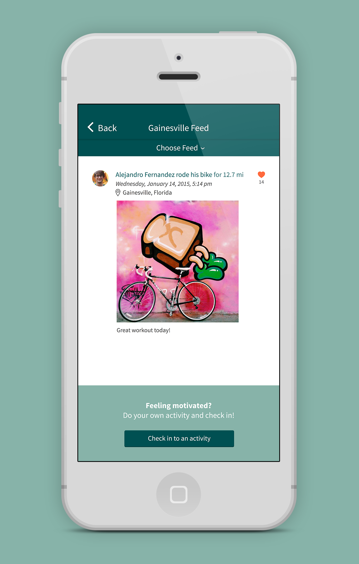
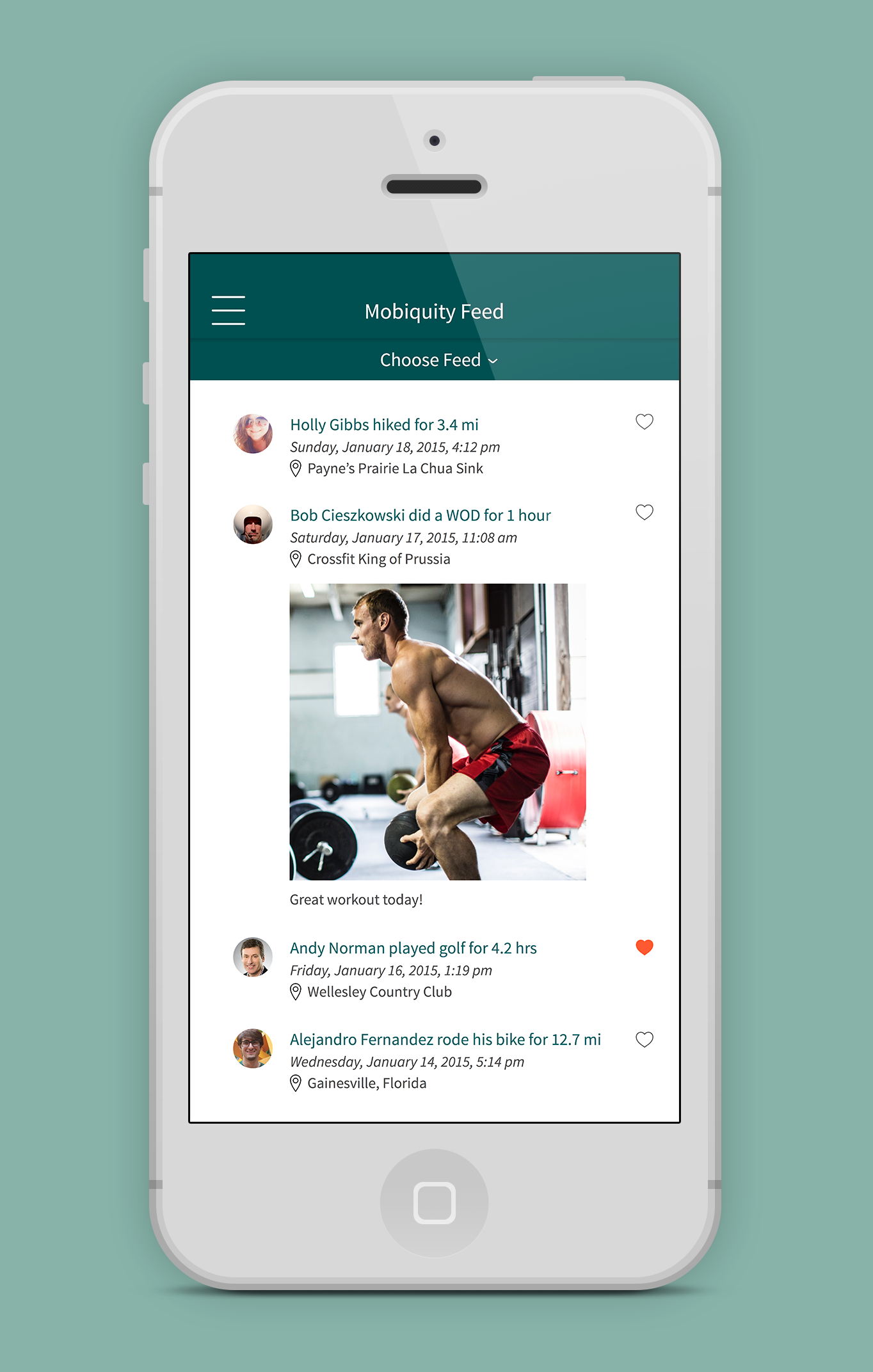
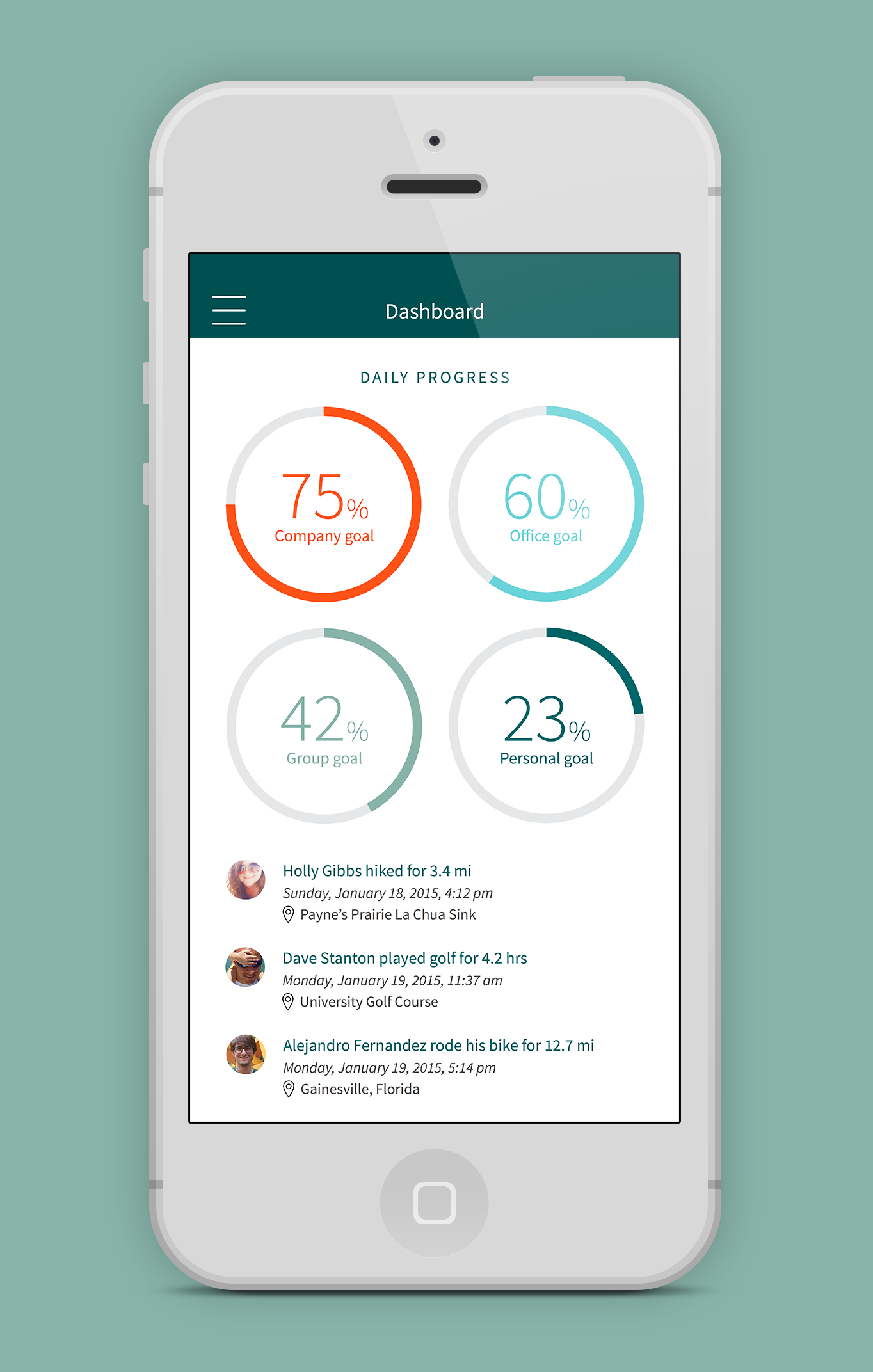
Workplace is a prototype we pitched to Weight Watchers® — an app that tracks activity and motivates employees to keep moving, and to be social while they're at it. The concept was designed to connect coworkers at an organization and encourage participation in health-based activities, including helping people on different teams meet up and explore their cities together as a group.
The design challenge was threading between two brand registers: Weight Watchers' warm, encouraging consumer brand and a workplace context that required a slightly more polished, professional tone. The app couldn't feel like it was pitching a weight loss product to employees during working hours, but it needed to carry the warmth that made the Weight Watchers program effective.
Problem
Faced with the challenge of motivating employees to be active and get outside, we decided to create a prototype for Weight Watchers® — a client we were working with — to show how a workplace-focused activity app could address this.
Process
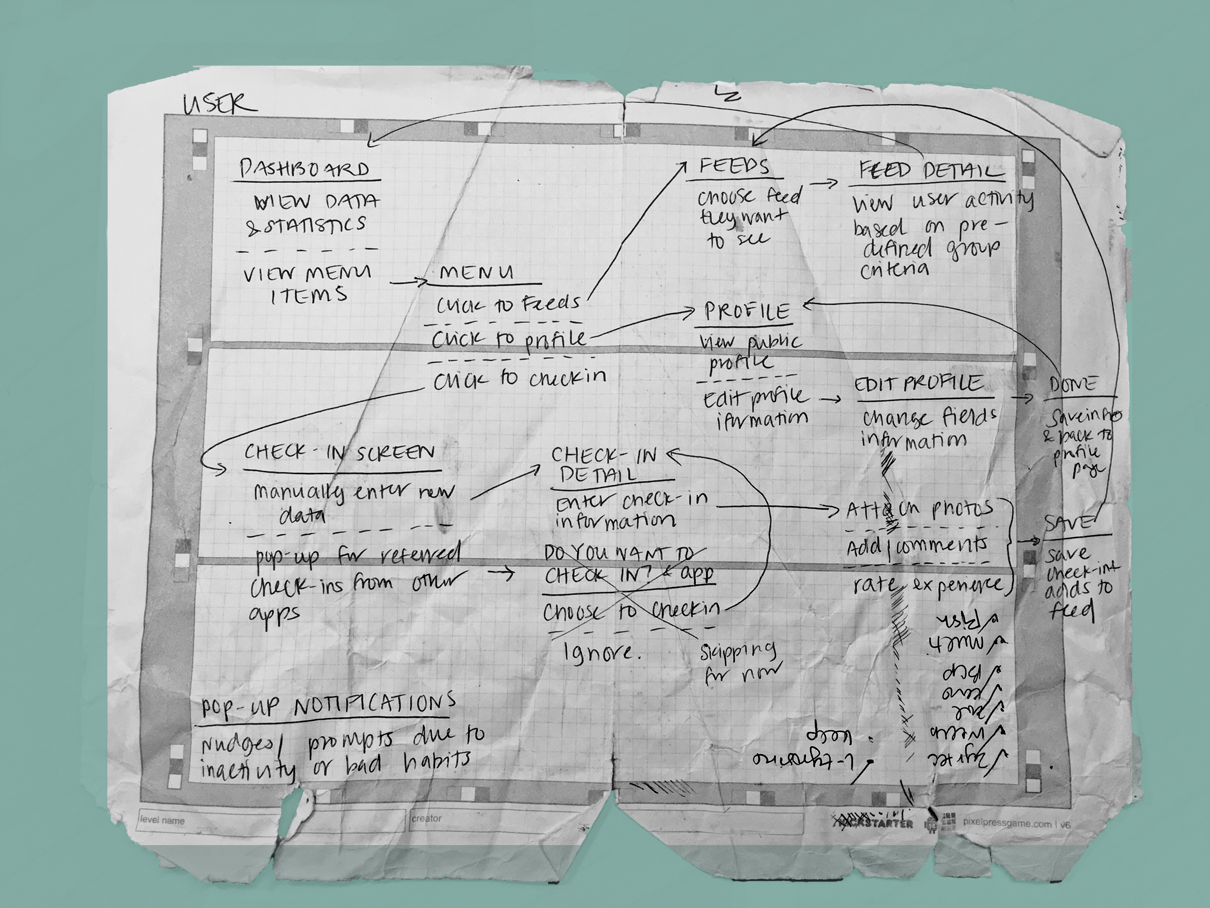
The technical lead on the project and I worked through several user personas and developed a proof of concept to present to the client. We mapped user flows to ensure the social and activity features connected naturally, and designed custom iconography to give the app a distinct visual voice within the Weight Watchers brand.

Learnings
The nuances of context in UI design became very clear to me through this project. The same visual elements carry different connotations depending on where and how they appear — and 'workplace' signals something specific that needed to be respected in the design. Understanding not just what users want to do but where they are and what context surrounds them is something I've carried into every subsequent project.