Holbrook Travel
Girl Scouts educational travel showcase
Context
Creative Director & Marketing Coordinator · 2012
Services: Print design · Brand partnership · Illustration direction · Copywriting support
Employer: Holbrook Travel · Partner: Girl Scouts of the USA
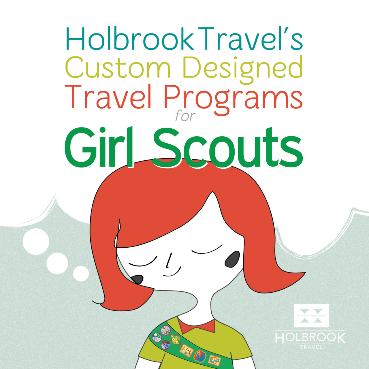
Holbrook Travel partnered with Girl Scouts of the USA to offer educational travel experiences — rainforest expeditions, wildlife conservation programs, and cultural immersion tours across Costa Rica, Belize, and the Galápagos Islands. The challenge was designing materials that worked for two audiences at once: troop leaders and parents evaluating a significant travel investment, and the girls who needed to actually want to go.
The challenge
Holbrook's standard marketing relied heavily on destination photography and an adult editorial voice — appropriate for their core market but unlikely to land with a Girl Scout troop. At the same time, materials that felt too playful or juvenile wouldn't close with the parents and troop leaders doing the actual decision-making.
A dual-audience piece also meant navigating two brand systems simultaneously: Holbrook's established visual identity and the Girl Scouts' partnership guidelines, both of which applied to every page.
Approach
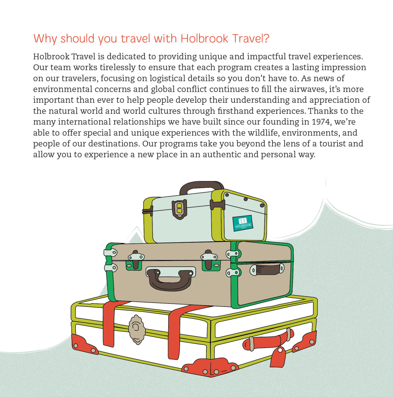
Rather than adapting Holbrook's photography-led templates, I shifted to an illustration-forward direction — friendly, character-driven, and warm without being childish. The illustrated Girl Scout on the cover and the suitcase spread give the piece an adventurous energy that speaks to younger readers, while the typography, layout structure, and body copy remain clear and credible for adults.
Color draws from the Girl Scouts' palette (green, yellow, white) while staying within Holbrook's brand parameters. The tri-fold format gives enough room for destination detail and key selling points without overwhelming either audience.
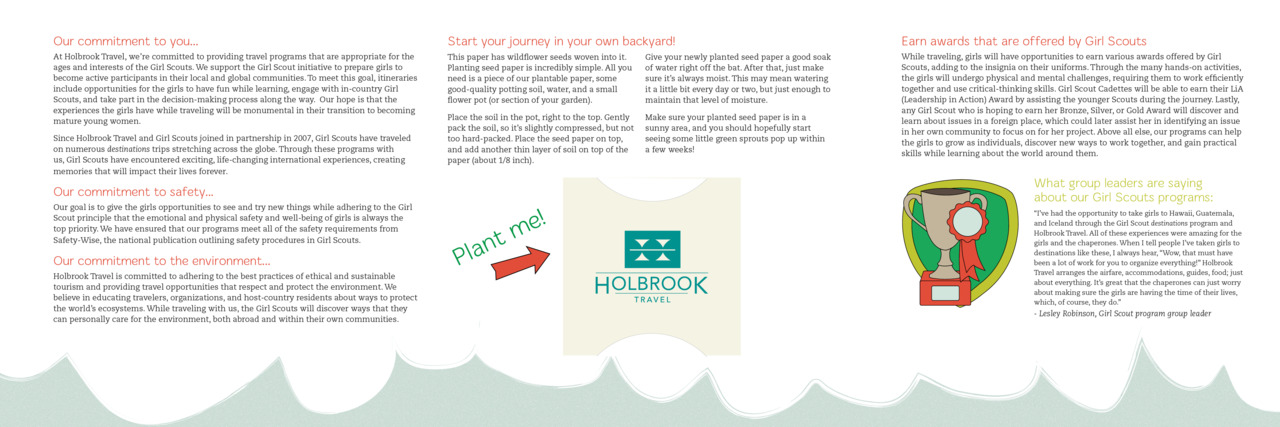
The standout element is a planted seed packet tucked into the brochure — a physical takeaway tied to the environmental stewardship theme of the program. It extended the piece into something memorable and on-brand for both organizations.
Outcomes
- Approved by both Holbrook and Girl Scouts brand stakeholders with minimal revisions
- Distributed at regional Girl Scouts events and through council communications channels
- Supported successful bookings for multiple troop groups in the program's first season
- The illustration-led approach informed subsequent Holbrook youth travel materials