Feathr
Feathr website redesign
Context
UX/UI Designer · 2015
Services: Web design · Illustration · Marketing materials
Typeface: Montserrat
Summary of work
Feathr, a Gainesville-based event marketing platform, was at an inflection point: the company was sharpening its product focus and needed a website that reflected its evolved positioning. The previous site felt scattered and undersold both the product's capabilities and the company's momentum. The redesign was an opportunity to build something that could carry the brand through its next growth phase.
The work involved both brand strategy and execution — figuring out what Feathr was saying, then designing the site that said it. I worked closely with the founders to understand their vision and their customers, then translated that into a site architecture and visual design that presented Feathr as a credible, capable partner for event marketers.
The visual direction moved away from the generic startup aesthetic of the previous site toward something more distinctive and confident — warmer in palette, cleaner in layout, with a stronger typographic voice that matched the team's personality.
My contributions
Brand strategy
Collaborated with Feathr's founders and marketing lead to define messaging strategy and visual direction as the company repositioned its brand and product offering.
Design leadership
Led the full site redesign — page layouts, visual language, and interaction patterns — while producing responsive designs for desktop and mobile contexts.
Visual identity
Moved the visual direction from a generic startup aesthetic toward something warmer and more distinctive — confident typography, refined palette, stronger brand personality.
Dev handoff
Delivered developer-ready assets and specifications for the engineering team to implement the redesign.
Process
The project began with two working sessions with the Feathr founders: one focused on positioning and messaging (who is this for, what do they care about, what does Feathr uniquely offer), and one focused on visual direction (inspiration gathering, brand attribute definition, and competitive positioning). These sessions produced a creative brief that guided all subsequent design decisions.
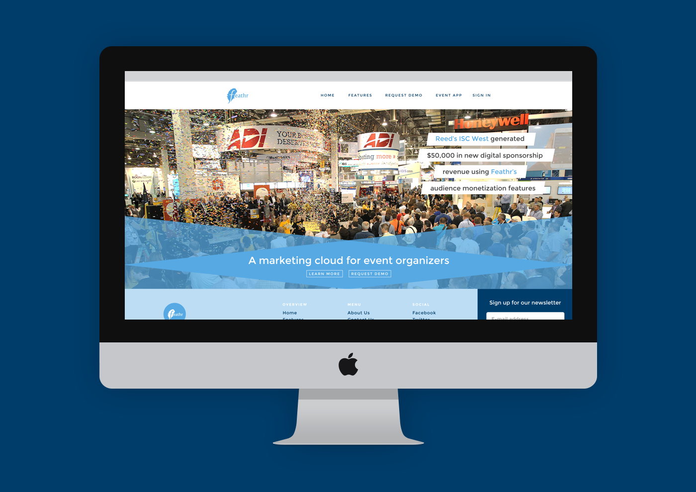
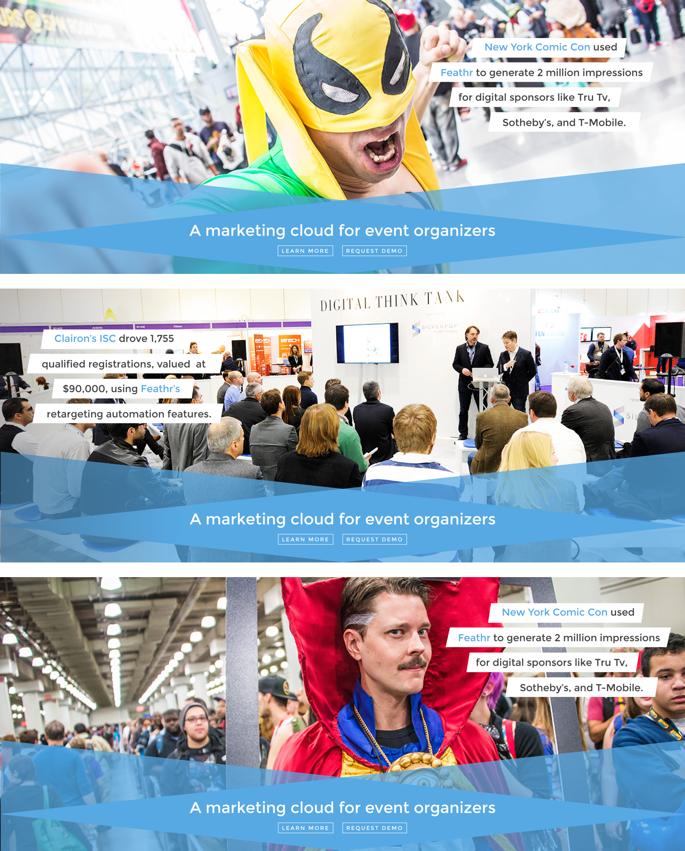
Testing found that users felt Feathr's message was directed towards industry 'insiders' and therefore their service wasn't for them. The company wanted to convey more of a friendly, approachable feel as they moved towards messaging that was more inclusive. I helped them to unify their site's color scheme, going with a primary palette of soft blues and a secondary scheme of bright, friendly colors to keep the feeling approachable. I updated their product illustrations to give them a more modern look, and also updated the typography treatments and imagery for the site.
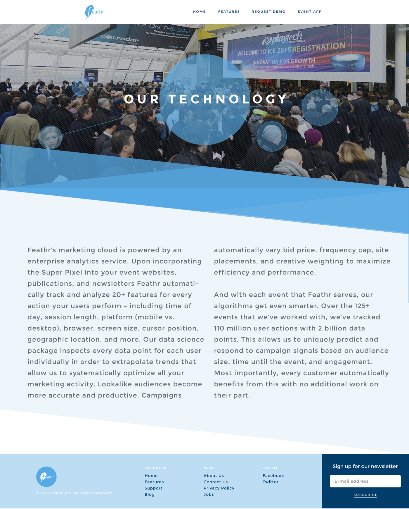
Wireframes covered the full site — homepage, features overview, pricing, customer stories, and about pages — and were reviewed with the team before moving to visual design. The visual design phase produced a new color palette, typography system, and component library that was applied across all pages.

Outcomes & impact
- The redesigned site launched ahead of a major industry conference where Feathr was exhibiting
- The founders reported that the new site significantly improved their ability to communicate Feathr's value in sales conversations — prospects came in better informed
- The visual system established in the project informed subsequent marketing and product design
- The site was cited as a design success in a local startup community roundup
Learnings
Early-stage startup website design is fundamentally about clarity — making a bet on what the company is and communicating that bet with conviction. The hardest part of this project was the strategic work: helping the founders get precise about their message, which required having honest conversations about what to leave out as much as what to include.
We needed a site that made someone say 'yes, that's exactly what we need' — not one that tried to appeal to everyone.
I also learned how much the visual language of a website communicates about a company's ambition and culture, independently of the words. The previous site accidentally signaled 'early-stage experiment.' The redesign signaled 'company that knows what it's doing.' Same company, same product, same team — completely different impression.